And furthermore ...

One Man's Treasure encourages the use of anonymous photographs posted here to illustrate books and album covers.
If an image appeals to you, contact John Toohey at johntoohey@hotmail.com.
Showing posts with label American West. Show all posts

Thursday, 11 June 2015

LAND OF THE GIANTS


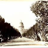
Postcards of the Redwood Highway
 “The nation behaves well if it treats its natural resources as assets which it must turn over to the next generation increased, and not impaired, in value.” 
Theodore Roosevelt


During the 1920s Ansel Adams photographed the Sierra Nevada and the Californian forests, establishing the image of a world that was sublime and pristine. Adams said wilderness was sacred and some influential people believed him. At the same time Charlie and Leslie Payne were running their postcard company Art Ray out of their van on the Redwood Highway, while Alexander ‘Zan’ Stark travelled the same road as well as others across the mountains ad into Nevada. To them the Redwood Highway was a rather more trashy experience, about as reverential as a plastic Jesus winking on the dashboard. It was a world where once great redwoods and Sequoias were turned into road tunnels, houses and even public toilets. But if honesty has anything to do with reflecting public taste, then Art Ray and Zan were much more honest than Adams. Their image of the highway accorded more closely with the official and the popular image. Between the wars, the more people who visited wilderness the more its status was validated.  The notion that wilderness ought to be protected from people never entered anyone’s head.

 
Today we are driving along the Redwood Highway, in the company of Art Ray, Zan Stark and Frank Patterson. It is the late 1920s (or thereabouts) and the towering trees have inspired two responses among Americans. One is to be overcome with awe at the power and majesty of nature and the other is to calculate how much cash could be made from cutting down a single tree. Some Americans can experience both simultaneously and not be aware of any contradiction, not the least Theodore Roosevelt, who died in 1919, before any of these were taken. Notice how Roosevelt chooses his words in the quote above, advocating neither the protection nor destruction of forests but responsible management; two words America has always struggled with when appearing together. These postcards epitomize the schizophrenic attitude to wilderness that infected the American psyche in the first decades of the last century. The Redwood Highway was a place to worship nature, and it was also a theme park. 

 
During the period when most of these photos were taken, the USA had the best environmental policy in the world. Every other country that had wilderness it wanted preserved adapted the American model. But for something to be the best in the world does not mean it has to be good, merely better than what anywhere else has to offer. The American model, such as it was imposed at Yellowstone, had parcels of wilderness that were not protected from development so much as dependent upon a particular type; tourism. There was nothing inconsistent in having thousands of tourists visiting places like Yellowstone and Yosemite and each individual being asked to imagine they were in some pristine wilderness. Even those two words were dubious. The ecosystems were barely given a moment’s thought: wolves were hunted to extinction in Yellowstone by the mid-1920s and being a national park never gave an area protection from grazing farm animals or logging. As for pristine; it conveniently avoided any idea there had been people living in these areas prior to the arrival of Europeans.

 
The dense fernbrakes are what we expect to find in an ancient forest, but only because we’ve been told to. Most genuinely old growth forests have been subject to thousands of years of human use. Prior to the arrival of the Europeans, the west coast was the most densely inhabited part of North America. We can be sure that fire was used to control the ground cover and promote particular plants. Thick undergrowth like this would have made hunting and movement difficult and when we look at the historical record, it is more common to read descriptions by Europeans remarking on how open the forests are. This photograph shows us what the forest was like after European intervention, when the Native Americans had been forced out of the redwood forests and the undergrowth was allowed to run amok. Our modern idea of wilderness as untouched and untamed is as much propaganda as the idea that First Nations people were passive caretakers who did nothing but watch plants grow.  


The redwoods of the Pacific coast and the Sequoia of the Sierra Nevada are different species of the cypress family. They owe their exceptional height to two factors. One is the competition in a densely populated forest where each tree was involved in a race to the sunlight that over several thousand years became increasingly distant from the rootstock. This can’t explain everything, otherwise all forests would have enormous trees. The second factor is their locations between the broad Pacific and the high Sierras. We don’t consider this part of the world tropical, it’s in the wrong place and it’s too cold, but if we think in terms of humidity, northern California rivals equatorial jungles. For trees to reach 75 metres or 250 feet tall, they don’t need vast amounts of rain but a steady, relentless damp.

 
Theodore Roosevelt was an early supporter of the conservation of the redwood forests and was instrumental in having the Muir Woods protected. The land put aside for the national park belonged to a lesser-known Republican, William Kent. Like Roosevelt, Kent wasn’t at all opposed to a timber industry but he realized that unless some areas were given protection the likely result would be the total destruction of redwood forest. The first steps were taken in 1908 when Roosevelt had the Muir Woods preserved as a national monument.
I have a theory about Roosevelt. Today he is known for three things: his environmental policies, his pre-presidential years as an adventurer, rough rider, cowboy, and for being the last president of the Gilded Age, when the capitalist class showed off its largesse by building public institutions: universities, museums and art galleries and libraries. Think of the latter two reputes and the first takes on a new tone. Here was a man who was passionate about frontiers, the physical ones he could explore on horseback and in canoes,, and the frontiers of knowledge, and by the turn of the century even France and Britain were looking to America to lead the way there. What is it to such a man then when forests are cut down and office towers built in their place? Cut down the wilderness and you remove the frontier, and the world has no need anymore for a man like Roosevelt. His job is done. Preserve wilderness and he can still believe there is a frontier.


Talking about the sacred and the profane; on the back of this postcard stamped 1946, Anita writes that she, Helen and Jack are ‘having a swell time’. At the Cathedral Tree, ‘we sat and listened to the music and it was just like being in church’. Cathedrals are circles of trees that grew up around a dead one and were named cathedrals because the way the light filtered through from the canopy reminded some people of the effect created in great European cathedrals. Anita is telling us however that she, Helen and Jack could sit in the circle and hear piped music, probably one of Bach’s works for organ. These days we say the way to appreciate the wild is to stand still in silence. In the 1940s the idea was to experience comparisons with the great works of man. What nature proposed, we had done better.

 
 The redwoods are among the oldest trees on the planet, with a few getting close to 4000 years old (still falling short of some nearby bristlecone pines by a millennium). We see that this one’s life came to a premature end in 1930. The lumberjacks who set about cutting it down could probably tell how old it was to within a century so when it fell they sliced off a disc and sent it on to whoever was managing the tourist facilities. Dendrochronology is the art of reading tree rings to understand climatic patterns. To people that can read them, tree rings reveal a precise story of shifting weather conditions. Although they cannot tell us who or what was living in the vicinity 500 years ago they can provide an explanation as to why everyone packed up and moved out.  To the rest of us the best that tree rings offer is a timeline that appears astonishing but tells us nothing. Well, we can see here that this tree was already sturdy and mature when William the Conqueror landed at Hastings, which needless to say is nowhere near northern California. And height-wise it was impressive by the time Columbus landed on an island in another ocean. As history lessons go, it’s a bit non sequitur. Still, there’s an irony at work. You want to impress on tourists how old these trees are but the only way you can do that is by cutting them down.


Things could be worse. An ancient tree, just a sapling when the three wise men were on their way to Bethlehem, could end up being turned into what some Americans inanely refer to as ‘comfort stations’. Is this divine retribution, a credit to man’s ingenuity or is it an indignity? Back then the second would have been the answer. Even passionate advocates for wilderness believed that tourism was going to nurture and ultimately protect national parks, so turning dead or dying trees into toilets would have a harmless compromise. It wasn’t until the 1960s, when the damage from 1920s era environmental policies became apparent, that people like Aldo Leopard proposed Washington rethink its environmental strategy while Edward Abbey insisted that everyone from Ansel Adams to Theodore Roosevelt and even the patron saint of the forests, John Muir, had got it wrong. 

 
Well it's been fun. We've witnessed the beauty of nature and the banality of man looking quite comfortable together, seen things that some of our contemporary Americans would rather we hadn't and others that remind us there was a time when the choices facing us were simpler We've saved the best for last. The drive through tree is most iconic image of the Redwood Highway. Even people who can't spell Sequoia know it's the tree you can drive through. During the 1920s and 30s there were several of these trees on the highway. Most, including the Coolidge, have died, which somehow doesn’t sound surprising. At least three are still in operation, and all owned privately so they come with a fee.  Adams photographed plenty of redwoods but it’s doubtful he ever photographed one of these trees – the car, Beaver and Wally Cleaver's faces pressed against the window, would have been anathema to his purist eye – but I can’t help feeling that his view is all the more deceitful for that.  Whether he was suggesting his view was what the Redwood forest looked like now or what it could look like in the future, it was created in the darkroom. He was like a good lawyer in that you had to pay attention to what he was leaving out. Zan Stark and Art Ray weren’t that clever but if you want to know how environmental policy worked in the 1920s and ‘30s, which is the same as wanting to know why some aspects don’t work today, they are the photographers to look at.

LAND OF THE GIANTS

Thursday, 7 May 2015

THE POSTMAN ALWAYS RINGS TWICE


Postcard views and their written messages
 “I don't film messages. I let the post office take care of those.”
Bernardo Bertolucci


Usually the correspondence on the backs of postcards is perfunctory and not worth a second glance. Someone has arrived somewhere and the weather is fine, or not. (What is this peculiarly English compulsion to start a postcard by describing the weather?) The very public face of the postcard discouraged people from revealing too much and serious correspondence required the traditional sealed letter. Occasionally however a card turns up with a written message that enhances, contradicts or otherwise changes the way we look at the image. This one, to a Mr. T. P. Carson of Polk St in Minneapolis, was posted from Hague, North Dakota on the 14th of July, 1911 and reads:
Dear Brother;
I am sending you just a glimpse of myself, my old man and my buckskin pony. You must excuse me for not writing but I have been so busy. Will write you a long letter soon. Hope you are as well as we both are. Love to you from us both.
Your sis, Mrs J Berg.
We can hear a rural Midwestern accent in her phrasing, and that odd mix of familiarity – ‘Sis’ – and formality - ‘Mrs J Berg – is also found in the image. The photographer was most likely a friend and the Bergs look like they are on their way to church; all dressed up with the wide and empty plains of North Dakota behind them. Image and text tell us a lot about the relentlessly long and dull struggle the prairie farmers endured at the turn of last century.


Around the same time and across the Atlantic an unidentified woman wrote from West Hill House in Hastings to ‘A’. West Hill House is a listed building, which in the 1930s was occupied by the popular author Catherine Cookson. With the resources of the Hastings library at hand it wouldn’t be that hard to track down the author of our card, which reads:
Thanks very much for the P.C of last night it came as a pleasant surprise. I am sorry Eva could not see you last night I have not heard from her so I do not know if she has gone to her new place or not. I had a postcard from Frank (Eva’s brother) this morning he wanted to know if I got home safe last Wednesday night & said he was sorry he did not see me again (Don’t laugh) I am sorry it is ended with your girl through us but still if your not worrying it doesn’t much matter does it I’m afraid there’s not much love lost between you.
The absence of punctuation, the sloppy grammar and the catty tone point to someone in her late teens or early twenties. Note her acknowledgement, even the faint boast, of the part she played in breaking up the relationship between A and his girl. A few years later she could be cast as one of the flippantly cruel young socialites in Evelyn Waugh’s novels. Notice that ‘A’ sends her a P.C but Frank sends her a postcard. I suppose casual abbreviation was one way she distinguished friends from hopeless dolts. Note too the otherwise straight topographical view she has chosen. West Hill House is probably visible in this image, which is why she selected it, but she is unaware that her choice of image reveals how prosaic and suburban her outlook really is. 

 To Germany on September the 13th 1909, where Ella writes to Miss Alice Duvet in Dorchester and in three brief sentences tells us a lot we may one day find useful.
Wouldn’t this stop a clock? In 7 days we start sail for America and if possible will land in 12 days. Most likely it will be 14.
The expression, to have a face that would stop a clock, was current at the time and referred to someone who was particularly ugly. Ella sounds too polite to brand anyone else that bad looking so we can assume she is the woman in the photo. Is that her father with the camera? The person who took this was most likely another family member or a local photographer working the tourist market. The most interesting detail is in regards to the time needed to cross the Atlantic. There’s quite a discrepancy, a whole 48 hours between 12 and 14 days, even for the mechanized and technological 1900s. If a face could stop a clock, heavy fog and storms could halt an ocean liner. 


As previous posts have claimed, Fred Judge was the quintessential British photographer, meaning not just that he photographed the life and the land in detail but it is also hard to imagine him working anywhere else. A couple of sentences in a Hastings newspaper from the 1910s suggest he may have taken a brief trip across the Channel to Calais. That, for Fred, was about as exotic as the world got. The number of the card indicates the photo was taken circa 1910 and the scene is somewhere along the south coast of England, most likely between Brighton and Hastings. So far there is nothing remarkable to say. But read on …
Dear Femihan
I received your letter of April 9th and enclosed a page on May 3rd, yesterday May 27th. I am thrilled by this news! “CHEERS”! But dear, do come quickly, before I go … It will be tragic if you arrived when I’m gone!! … I leave Cairo for Dhour el Choueir, Lebanon; (that’s my address) at the beginning of July. Won’t you be here before? I hope & pray. I rang up the Diara (?) today, your uncle could not give me any news as he knew none! Hoping to see you with all the longing of “long absence” Yours, with love, Leila.   
Leila Mestrick has posted the card from Cairo, Egypt to Femihan, who lives in the Maltepe district of Ankara, Turkey. The punctuation and underlining for emphasis are all Leila’s. But how does a very English postcard get mailed from Cairo? Leila has also dated the card May 28th ’45, which helps explain things: this was during the weeks of progressive surrender by the German forces and Britain would have been in control of Cairo. Leila’s surname is also English, so presumably she married an Englishman. Notice how her English is impeccable though she emphasizes ‘cheers’, a very British idiom, indicating that English is her second language. Femihan speaks it too, demonstrating what we can already read; both women are from educated, prosperous families. Interesting that although we know the photograph was taken on the English coast there isn’t a single detail within it to indicate that. It could have been taken anywhere. Leila’s choice of card was deliberate. She didn’t want one showing a distinctly British scene, of castles or sheep in the fields. Is it too much to see the image of waves crashing on rocks as an allusion to powerful emotions that Femihan would get even if the English hubby didn't? And was there a newsagent in Cairo selling English papers, stationery and postcards or did Leila bring a supply of postcards over from England? Both possibilities tell us something about the British colony in Cairo during the war.

POSTMAN RINGS TWICE

Friday, 9 January 2015

IMAGE/TEXT

A (very) brief history of typography, design and real photo postcards
“Design can be art. Design can be aesthetics. Design is so simple, that's why it is so complicated.” 
Paul Rand


A statistic from 1903 tells us that an average of 1 446 938 postcards were mailed in Germany every day that year (You have to love German precision). Basic maths tells us that was in the vicinity of 376 203 880 for that year, and given a certain percent of the population of 56 000 000 were too old, too young or had no interest, clearly some people were very busy. Not all the postcards were photographic but 1903 was also the year that the real photographic postcard emerged as the latest fashion in mail culture. It seems that images of stage actresses were the most popular but so were postcards that amateur photographers made themselves, and then there were images like these, where studios and publishers took current ideas in design and transformed them into photographs. It’s not hard to see why: the only reasons a studio wouldn’t embrace the new process were that it was too expensive or that the studio had established some success with the half-tone process, and neither made much sense businesswise considering those figures from Germany. This card with its obvious religious message comes from an unidentified studio. Though the message is in French the studio could have been based in Germany: studios were never constrained by political boundaries. It could have been running a profitable line in soft porn images as well. With the kind of money involved in the photographic postcard trade, it paid to be pragmatic. If there were a market across the border for Catholic imagery a hard headed Lutheran in Berlin would have no trouble responding to it.

 
John Beagles & Co was one of the most prolific publishers of photographic postcards in Britain up to the 1930s and specialized in stage stars. This was published before World War 1 so the idea of remembrance is uncertain. The tulips (?) generally refer to love – which makes sense in an image filled with beautiful women – and the horseshoe of course means luck, but ‘remembrance’ normally implies mourning and while it wouldn’t be strange to publish a series of cards intended to be sent to the recently bereaved it would be odd to design such a card filled with a collage of famous actresses. Possibly it refers to John Beagles himself, who died in 1909. The company could have produced a series commemorating its founder showing portraits from some of its best known cards.


 Barnstaple is a small town in Devon, which at the beginning of the last century only had a developing reputation as a tourist destination. The postcard was published by J. Welch & Sons of Portsmouth. If the publishers were using templates sourced from elsewhere they may have had little to do with the design of the finished product and may not have even supplied the scenes of the town. The motifs could have been used for any town in Britain and it is also possible that the letters with their collages of women and girls were created elsewhere. The price for a photographic postcard in England was a penny and even though some are on record as selling in the hundreds of thousands, it’s unlikely that Welch & Sons would invest any time on the typography for a card selling in small town Barnstaple. Note the collage of the girls and women. It is a feature that can always date a postcard to being pre World War 1; not because the war had anything to do with it but because fashions changed.

 
 No account of typography and design in photo postcards can be complete without examples from the Reutlinger studio. They produced the most sophisticated examples and dominated the French market. A comparison with the Barnstaple card is enough to show why. Even though the studio mass produced images and recycled the photographs - this portrait of Gilda D’Arthy would appear on at least half a dozen other designs - there was always a sense that if the postcard wasn’t unique it was different. This comes from a series employing the Art Nouveau typography and featuring a woman against the backdrop of a lake. Together the letters spell out ‘Reutlinger’ and the idea was for people to collect the full set. Another statistic from 1903 indicates that of the nearly 200 000 000 postcards bought in Britain that year, only a quarter were posted. The real market lay with collectors and the trick was to make sure they always returned to buy more. 

 
 Postmarked 1930 but most likely produced in the 1920s, this Freudian double entendre urging Dad to use his cane and repopulate France was a response to the huge loss of life in the First World War and the 1918 flu epidemic, which together accounted for over two million deaths, or around five percent of the population. Even before the turn of the century, France’s population had been considered too low for full economic prosperity. It wouldn’t fully stabilize until the 1960s, when with independence millions of immigrants from former colonies in Africa and the Middle East arrived. We don’t know how successful this campaign was but it’s doubtful Mum would have been too thrilled at the prospect of thirteen children. 

    
 The Rose Stereograph Company was founded in Melbourne in the 1880s by George Rose, a man who realized that for a stereographic company to thrive it needed international scenes and the best way to get them was to do the travelling himself. By the 1920s the market for stereographs was in decline and the company turned to producing postcards. Mostly, it appears, the postcards were standard topographical scenes but this is an inspired example of what could be achieved with a little imagination. I can’t say I’ve seen anything else quite like it and the inclusion of the waratah with the eucalyptus flowers suggests the template may have been particular to the company and not sourced from elsewhere. Note the sign on the building at the right for Martin and Pleasance Homeopathic Pharmacy. Like the Rose Postcard Company, it is still in business.  

 
 From the 1930s onwards the strongest challenge to the real photo postcard came from brightly coloured linen cards and in the U.S the Curt Teich Company ruled that roost. There’s good research on the company with stories of a small army of salesmen travelling desert highways and offering lonely gas stations and motels such tempting ideas as the addition of a couple of girls in bikinis to the image at little extra cost. The large letter linen postcard with the name of the place, town or city writ large is a distinctly American vernacular. Large letter photo postcards are not as common though in some ways they are much better. The photos in this postcard were taken by the Nevada Photo Service but we are more interested in the illustrations. Lew Hymek was a newspaper cartoonist in Reno during the 1930s and 40s, the era when the town suddenly boomed on account of relaxed gambling, and divorce laws before mob town Las Vegas took all the attention. Obviously there was a collaboration between Hymek and Lawrence Engel, who operated the Nevada Photo Service, and because this is a photographic postcard it could have been produced and published by the Nevada Photo Service. A linen card version would need to be sent to somewhere like Curt Teich that had the printing technology. This is better than a linen card because it displays Hymek’s skills and it has that cowboy glamour we associate with Reno when North Virginia St was still worth visiting.

IMAGE/TEXT

Saturday, 19 April 2014

CANAL DREAMS


An amateur photographer goes to Panama in 1915
“My impression about the Panama Canal is that the great revolution it is going to introduce in the trade of the world is in the trade between the east and the west coast of the United States.”
William H. Taft


In 1915 someone, or more likely a group of people, set out to experience the best America had to offer, which that year meant the Panama-Pacific International Exposition in San Francisco and the opening of the Panama Canal. The result is this bundle of photographs. Crudely printed on printing out paper and heavy, fibre based paper, they have the quality of work carried out in a home darkroom, by someone who was yet to master the trickiest part of amateur photography. Some of them may have turned out to be excellent images had they been finished by someone who knew what he or she was doing, but high standards aren’t a synonym for interesting.


Take this shot of the Washington Monument: an object lesson in why someone needed to have read the Kodak photography made easy manual, but there are so many millions of photographs of the monument that get everything right. Do we really need any more dusk or night shots? Finally we have one that catches the eye.


There is a gap in the sequence between Washington and California. That’s a shame because if we follow the logical progression from Washington to Panama, through the Sierra Nevada, it means they probably drove across the country. Bear in mind that in 1915 that meant unreliable cars on unsealed roads, for at least a couple of weeks. Not many were willing to try that. Unless I have made a mistake in identifying a couple of photos, this image comes next. The sign on the garage indicates it is Lassen County, up in the Sierra Nevada and one of the most picturesque areas in California. There’s a small ‘school’ of photographers: Jervie Henry Eastman, Lawrence Engel and Burton Frasher (kind of), who started out in the county’s timber industry and took up photography in their spare time until they learned to make a profit from it.


Eagle Lake in Lassen County. All of these prints are 4x7 inches, which makes a difference when you realize how large this one is. Its one that breaks all the rules in the Kodak photography made easy manual: subject too far away, too much white space, ignorance of the rule of thirds etcetera, but would they have improved it? 


Richardson Springs, just over 100 miles south west of Susanville, Lassen County, and one of several hot springs in the Sierras that were drawing the tourists in the 1910s. There are a couple of postcards going on Ebay taken from a similar point of view. Did our photographer think about buying one then realized he or she could do better themselves?


An unknown town, somewhere. Like some others, this has the typical light, yellowish look of printing out paper. The uneven printing supports the theory. Like the scene from Eagle Lake, it doesn’t break the rules so much as show ignorance of them. Good.


We’ve arrived in San Francisco, in time for the Panama Pacific Expo, but before we go there, let’s head to Ocean Beach and to Seal Rocks, (note the swell) and to …


The view from Cliff House. So much to look at in this view. In the distance we get the windmills at the edge of Golden Gate Park, the crowds on the beach, the cars, the smokestack, and the curious looking structures on the sands are likely to be building materials for the sea wall that was being constructed.


Here, on the cliffs above the beach we have the Sutro Baths before they were a ruin. There’s an argument that in the late 19th century capitalism achieved a kind of social apogee. This was the so-called gilded age, when wealthy industrialists ameliorated their extravagance by returning some of their gains to the people in the form of universities, opera houses and museums. The Sutro Baths are often cited as an example. Having made his fortune exploiting labour, Adolph Sutro showed his benevolence by building venues for public entertainment across the city. Historians who don’t hold back on Leland Stanford, who see his altruism as little more than self-aggrandisement, reserve some affection for Sutro.


This one makes me think our photographer was Canadian. Well, given the photos were bought in Montreal, you might expect that, but without this image we’d have no real reason to think so. It’s hard to imagine an American showing special interest in the Canadian Hall at the Expo. 


What was it about international expositions that dictated the architecture had to look as tacky as it was ostentatious? Right at the moment when neo-classical architecture was being derided as outmoded and bombastic, the one place you could still find it was at a world’s fair, which was supposed to celebrate the modern world. We can probably blame the 1893 World’s Fair in Chicago, though the Parisians deserve a finger pointed their way as well. Here we have a view of the Tower of Jewels that completely fails to express any of the grandeur the building was supposed to have. It looks like it was built out of papier-maché.
Here’s an extract from a brochure, sourced from the Virtual Museum of the City of San Francisco. It says it all:
“An expenditure of fifty million dollars in construction.
Fifty millions more in the intrinsic value of exhibitions.
Six hundred and twenty-five acres of Palaces and gardens entrancingly beautiful.
Eleven great Exhibit Palaces crowded with objects of interest from every portion of the globe.
Spacious courts and miles on miles of ornamented avenues.
More than two hundred and fifty groups of statuary by world’s masters.
Huge mural paintings, masterpieces by the greatest artists.”
That means money, size, more money, even bigger sizes, and no accounting for taste. 


The choice of San Francisco as venue for the World Expo in 1915 had a lot to do with the Panama Canal, but just down the road at Balboa Park, San Diego had the more official event; the Panama-California Exposition. For political and military historians, the U.S entry into World War 1 is a watershed in the nation’s inexorable rise to global domination, but economic historians look more to the opening of the Canal a couple of years earlier. Taft was right when he suggested European trade wouldn’t be greatly affected by the Canal, except that it secured American authority over the Atlantic and Pacific seaboards.


The very brief account of the Canal goes as follows: Under the directorship of Ferdinand de Lesseps, the French begin construction in 1881. Tens of thousands of workers are killed by malaria and industrial accidents. It is generally considered a fiasco. In 1903 President Theodore Roosevelt annexes Panama with a naval blockade. A succession of engineers are appointed to oversee the project. Most who visit the site wisely resign as soon as possible. The project is bigger and more complex than anyone, including Roosevelt, imagined …


This synopsis makes no mention of the ways debate about the Canal fractured U.S Congress, the creative economics, the figures showing that black workers were ten times more likely to die from yellow fever and malaria than white workers, and various other statistics that baffle the imagination. All that is put aside when the Canal is officially opened in August 1914. It is widely acclaimed as one of the great engineering triumphs in world history. It is this point – the fact America could pull off what Europe couldn’t – that really establishes the nation in international consciousness as the power to reckon with. 


The 1915 Expo and the construction of the Canal were well documented by professional photographers. Amateur views are much less common. Even rarer are collections like this that give them a shared context, and suggest a bigger story of a journey across the U.S. If the view of the Washington Monument came at the end of the journey, there’s still a sense of people heading out to document the country and be witness to its history.

VIEW THE GALLERY HERE  
CANAL DREAMS

Friday, 13 December 2013

ALONG THE NAVAJO TRAIL

Some Burton Frasher postcards of Native Americans
 “Any man who thinks he can be happy and prosperous by letting the government take care of him better take a closer look at the American Indian.”
Henry Ford


If the first word that comes to mind when you look at this postcard is ‘stereotype’, Burton Frasher would probably have been satisfied. It meant that he had taken a photo a lot of Americans understood so it was sure to be popular. He comes across as a man of many interests, with a sharp eye for the beauty of the landscape, but in business he was a pragmatist. If clichés sold well he would make clichés and to hell with his legacy. He took hundreds of photographs of Native Americans that he turned into postcards and more than a few are of noble savages, Indian princesses and cute scenes of babies wrapped in papooses. It is important to make that clear, because he also took a lot that show something deeper. In a way he is like John Wayne’s character Captain York in Fort Apache: a man who has lived long enough among a people to understand and respect their ways and mores but is conditioned to follow another path. Comparing this against some of Frasher’s other postcards, I think these people are from the Acoma Pueblo.


Frasher was based in Pomona, California, and the Pomona Library has thousands of his photographs in its archive. Quite a few, though apparently still a fraction of the complete works, are online here: http://content.ci.pomona.ca.us/index_frasher.php. If you are interested in real photo postcards, landscape photography or the American west and you don’t know about the Frasher’s Fotos collection, prepare to spend a few hours looking at his work. For this post we are only interested in the photos he took of Navajo, Hopi and Apache people in the American southwest.
Most of them belong to what could be called the National Geographic School of Photography: the images are anthropological and are carefully composed so as to contain everything we need to know. The caption for this scene is almost superfluous. We can see where and how people live and what they do. What is interesting about it, as with every photo here bar the first one, is its candid appearance. They are obviously aware of Frasher – he used a view camera on a tripod and was hard to ignore – but they aren’t posing for him. 


 In the Hopi butterfly dance the women wear elaborate head dresses and the men much more simple costumes to thank the spirits or, so far as I understand things, politely ask them to keep up the good weather. The colourful costumes and the absence of any militaristic overtones made the butterfly dance popular with tourists. There are a few things to note about this photograph. The first is the setting. There are hundreds of postcards of Hopi dancers floating about, most showing the tourists and reservation police, or some background detail that makes it apparent who the dance is being performed for. We can’t be so sure with this scene. The people are stationary so we could assume they are waiting for the performance to start but, like all the best National Geographic photos, we could be looking at an actual performance; one the tourists don’t get to see.
I could be reading too much into this photo but the way the man on the far left looks away at something off camera, breaks up the pattern. It suggests these people aren’t posing for Frasher.
I like the boy sitting down at the front too. The scan at the Frasher Collection (search under ‘butterfly’) is clearer. He looks decidedly bored. 

  
So far as is known, the Navajo have lived in Canyon de Chelly since the 14th century. There were others before them but the records are hazy. From the 1860s onwards the U.S Government did its best to drive the Navajo out. The most notorious effort was a massacre led by that hero of American popular culture, Kit Carson, in 1864. In 1931 Canyon de Chelly was declared a national park under the jurisdiction of the Navajo nation. To Washington’s credit, it would be another 50 years before Australia framed legislation that gave its indigenous inhabitants similar rights over their traditional land. Thanks to the Pomona Library’s Frasher Collection, we can date this postcard to 1935, when the Canyon was under Navajo control, and that would suggest this man in one of the official guides, without which outsiders weren’t permitted to enter the area.
It’s a good photo, not a great one, but what gives it particular interest is the comparison …


… To this one. Look at the different postures of the riders, how this boy leans forward, tense and uncertain about the photographer. It is dated 1936 in the Frasher archives. Referring back to John Wayne and Fort Apache, which came out in 1948: for those of us who grew up watching Native Americans being played by Anthony Quinn (Mexican), Michael Ansara (Syrian) and Michael Pate (Australian), it was a genuine shock to see Apaches played by actual Apaches and Navajos by Navajos. We can read an arc of redemption in Johns Ford and Wayne, from their 1930s films where Native Americans are not much more than bloodthirsty hoodlums on horseback to Fort Apache, where the disgust at their treatment by government agents and the cavalry is apparent. And this was twenty years before the civil rights movement, when it became easy to depict Wayne as a right wing gun nut. All this to wonder if the man in this photo may have played an extra in Ford’s films, and was Frasher like Ford and Wayne a man who saw enough to read the lies in the myth?


Which brings us to this image and a scene that speaks of acute poverty, dispossession and desolation; to us anyway. Was that what Frasher saw? Bear in mind that in the 1930s postcard photographers sought the positive, beautiful and exotic in their images and to a lot of Americans the original inhabitants were exotic. If you lived in New York or Chicago for example, the chances of meeting a Native American who still lived by traditional ways were unlikely unless you travelled to the southwest. This didn’t mean New Yorkers had no idea what was going on in Arizona but they might have preferred the image at the top of the post to this one.
Consider the caption: “Arizona Apaches”. There is another version of this postcard that says it was taken “North of Hwy 70 between Globe and Stafford”. That places it just west of Phoenix and something in the phrasing suggests that Frasher was driving along the highway when he saw the couple and pulled over to take a photo.  It is possible that he saw them as exotic examples of the original America and examples of social neglect and thought that customers would want postcards of ‘real’ Apaches as opposed to stereotypes. This was taken in the 1930s, when the closest contact most Americans had with Apaches was on the cinema screen. You’ll notice the couple don’t look pleased to be having their photo taken but they aren’t resisting. It is possible that Frasher knew enough of the Apache language to be able to approach them.


The final image was taken in 1936. There are two other postcards in the Pomona collection showing the same two women at this event. The scene is full of detail, and carefully composed so the telephone pole isolates the man from the women, but it doesn’t tell us much. They could be at a rodeo, a tribal meeting or a market.
Whether you think Frasher’s photos of Native Americans are his best work depends upon your preference though several of these would be among his best photos of Native Americans. They don’t challenge any photographic rules and they conform to a safe idea of how indigenous people should be depicted, but placed against the great mass of postcard portraits and tourist scenes available they have a candour other photographers avoided. The language in his captions belongs to the 1930s but most of these are studies of people, not types.

VIEW THE GALLERY HERE
ALONG THE NAVAJO TRAIL

Sunday, 17 November 2013

COUNTRY ROADS

 
Some postcards of rural America
“The past is a foreign country; they do things differently there.” 
L. P Hartley: The Go Between


At a conference a few months ago we were asked to consider the argument that in the future history will be based around images. Central to the case is the idea of the photograph as trace, a concept that is open to interpretation within academia so hard to understand outside of it. Anyway, we are familiar with one of its basics, that the photograph is a subjective record of an event and when we look at one we are obliged to consider various elements outside of it, such as who we are and what we respond to in it.  The devil is always in the details. We can see the above photograph was taken around the beginning of the last century and we can think of several reasons why it was taken, but note the woman second from the left. Not only does she have a holster strapped to her waist, she shares holding the rifle with the man, as though both claim ownership of it. Most of us would assume it would be the man who’d wear the holster. Why she does however seems to me to be part of the issue around this idea of the trace. She’s presenting us with a piece of evidence that might challenges our assumptions but we can’t treat it as categorical. We don’t know she didn’t strap on her husband’s holster just for the photo. Behind the woman second from the right is a sign painted on the wagon. The complete sign would read, “New Stoughton Wagon”. The Stoughton Wagon Works was in Stoughton, Wisconsin. Well, that answers a question, but not an important one.


Here’s a different type of problem. Which Locust Grove was this photo taken at? There are quite a few across the U.S, mostly in the Midwest, and all of them small farming towns. There’s a lot to read in this image: most of the kids look like they are in lower primary and come from poor farms, which would fit with what we know about children at that time being taken out of school early to go to work. The schoolhouse looks like it has one classroom. You can read a lot into the individual faces but beyond that, until we know which school it is and who the people are, all that is speculation.


Watching Disfarmer: A Portrait of America it was easy to understand the point of view of some of Heber Springs’ inhabitants. They’d seen people from the big cities turn up and turn their one and only famous resident into an industry. In some cases, you think, they’d been persuaded to hand over photographs only to see them suddenly get a massive price tag attached to them. It probably reminded them of various real estate and insurance agents who had blown into town over the years. And some of the rapturous analysis of Disfarmer wasn’t that persuasive. One commentator explained the Disfarmer style as though it was his and his only. Ask anyone who collects studio portraits: there were hundreds of small town studios using the Disfarmer approach, putting the customer in front of a plain backdrop and telling them to behave.
I think this portrait is the equal of anything by Disfarmer. Here you have the straight and unaffected portrait from small town America, and something more. There’s just enough information to tell you she probably drives this car out on the farm, but where that would be exactly, who knows. The postcard was bought in Nevada but it didn’t have to be taken there. It has a cold feeling to it, as if there isn’t much to scrape from the earth once the snow thaws.


Another postcard that shows how widespread the Disfarmer approach was, although, when I see a dusty workspace like this I also think of Walker Evans. Both are false allusions. What is striking about this image has to do with how carefully arranged everything is. It could be a theatrical stage shot except no theatre could make the dust authentic.


When I bought this card I did the usual brief research and discovered two things that had not occurred to me. The first is that there is a sub-genre in postcards based around telephone and electricity poles. The other is that there are groups dedicated to collecting them. We’re inclined to think that the modern world made its entrance in an automobile but for small towns it really arrived with the telephone. And it wasn’t a case of bringing the world to Main Street but the other way around. Towns that once could be isolated for weeks following a flood or a blizzard could now make contact with the outside world. I don’t share the passion for old postcards of telephone poles but it is to be encouraged. It beats watching videos of Miley Cyrus.


The early postcard photographers often functioned as provisional news agencies, recording events such as the erection of telephone poles that were of little interest outside the local community. They were also the local advertising service. There are a lot of postcards of shop interiors, and a lot, like this one, are beautifully lit, full of sharp detail and have some element that would appall modern ad men. If photographs of events tell us something of the unfolding history of small towns, these scenes of shop interiors reveal more about the society. Note the way the cans and bottles behind the counter have been so neatly stacked. From our point of view the design is apparent. Someone didn’t just want to show what goods were on sale, they wanted a beautiful display. So what about the nun at the right? 


The moment I saw this postcard I thought of Michael Lesy’s Wisconsin Death Trip, but only because I recall odd scenes of men and horses being part of a recurring theme. Partly because he is photographed outside of the bakery, we might think this is an odd image too, though at the time neither subject nor photographer would have thought so. What really gives it its strangeness is the slight tilt of the horizontal plane. When film-makers want to suggest altered states they subtly tilt the horizon to about the same degree. On the back someone has written ‘Overland Park Ks’. At the turn of last century Overland Park was about ten miles outside of Kansas City. You could ride in but it would take most of the morning. He carries a crop so he must be going somewhere. Today Overland Park is a suburb of Midwest middle America, lined with wide, neat green verges.


This is from Brattleboro, a mill town in Vermont. F. L Shaw pops up in the town’s archives, mostly as a member of the Vermont Wheel Club, which started off as bicyclists but by the 1910s had become the regional advocate for automobiles. My guess is either Shaw or Hartmann is the man immediately to the left of the horse and the people are getting ready for a July 4th celebration. The world has many images of people standing outside stores. They always tell us more than whatever it is we are looking for.


Speaking of history and the trace. It occurs to me that I’m fairly well up on the U.S 1848 to 1890 and 1920 to now, but that bubble in between remains a mystery. I recall an episode of Twilight Zone where a man stumbled into small town America C1910, and I watched the Disney version of Pollyanna when I was young. Both inform the idea that small town America at the century’s turn was a gentle paradise. I suspect otherwise. The real Pollyanna would have had to deal with polio or typhoid and if it was your fortune to slip back in time to small town America it might strike you how poor a lot of the citizens were. So, welcome to the Santa Rosa Rose Carnival, California’s ongoing celebration of all that was worth preserving and has since vanished. We know that every time corporate America raises its head some part of the nation’s soul dies, but let’s not fool ourselves. We are talking about the trace, that subtle, mercurial element of photography that suggests we are looking at history then tells us it wasn’t necessarily that way. Look at the faces of these women: some smile but the others look stony, as if to tell us they can dress like Greek nymphs but frankly, they’re not in the mood for playing the game. They have other things on their mind. But maybe that’s my interpretation. You see things otherwise.

COUNTRY ROADS