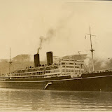
And furthermore ...

One Man's Treasure encourages the use of anonymous photographs posted here to illustrate books and album covers.
If an image appeals to you, contact John Toohey at johntoohey@hotmail.com.
Showing posts with label the sea. Show all posts

Saturday, 17 September 2016

LAND

Fourteen photographs of the English Landscape
“The ordinary can be absolutely miraculous.”
Simon Armitage


The fourteen photos here, each measuring twelve by eight centimetres, were found at Spitalfields Market. Some of them look like they are of the moorlands in Derbyshire at the edge of the Pennines. Others look like they come from the east coast of Yorkshire, near Scarborough or Whitby.

 They lay among small stacks of old hardbacks and ephemera spread across the table. The dealer couldn’t say much about them except he had had them for some time, they’d be cheaper the more I bought and they had come with ‘a lot of stuff to do with the Festival of Britain’. 

That made sense. The photos looked to be from around that time – 1951 – and they look to be the work of a professional; someone sent out to take a set of photos for a magazine article on the splendours of the north. Certainly we can see why someone thought there was a landscape worth promoting.


The Pennines and the Derbyshire moors, which is where we are now decided we are, can invoke many associations, from Pride and Prejudice to Myra Hindley and everything in between, but these days Simon Armitage, in particular his translation or interpretation of Gawain and the Green Knight and Pearl. Although the identity original author is unknown, scholars agree that he wrote both poems in the late 14th century and linguistic clues indicate he came from this area.

 
 A brief synopsis of the first: One New Year’s Day the Green Knight turns up at King Arthur’s court and asks to have his head cut off. Sir Gawain obliges but must fulfil a promise to meet the beheaded one at the Green Chapel in a year’s time. Gawain sets out and somewhere in the damp landscape he finds a castle. The master welcomes him then heads off the next morning on a hunt while Gawain keeps his beautiful wife company, and you just have to read it yourself. The landscape, as Armitage describes it anyway, is more rugged than these images of moorland suggest, more like parts of Staffordshire to the west.

 
 Pearl however takes place on open land, where a man grieving for his young daughter Pearl, follows a river and meets a woman walking on the other side. They talk across the water and she reveals she is his daughter, now grown up and a Queen of Christ. They debate various issues this raises until, desperate to reach out to her, the man jumps into the river and tries to cross it. 

 
Not that either Gawain or Pearl are dependent upon the landscape to tell their story although in Gawain there is the sense that up here it is wild and rugged, especially compared to the more gentle lands in the south where Arthur has his court. Also, in both there is an idea that the landscape is mutable, which is important in moorland where the weather can shift by the hour.


Even though they are found across Britain, the dry stone wall is something of an icon on the Yorkshire dales, the way black windmills belong to Norfolk. What gives walls like this one their timelessness isn’t the stonework so much as the feeling this was built with some purpose in mind but that has been forgotten for centuries. It meanders across the land.

 
 Speaking of Norfolk, this looks so much like the coast around Cromer and Happisburgh that we could put all doubt aside. That exposed reef can be thought of as the edge of Doggerland, the now submerged plain that once linked Britain to Europe and was home to mammoths, lions, rhinos and Neanderthals. Our photographer wouldn’t have known that, or that the oldest relic of any human in Europe would be found near here. But then, in 1951 a lot of people thought anything from the time before the war was old.

 
Even if I had bought these in another country, we’d still know it was England. The patchwork fields and hedgerows tell us it can’t be anywhere else. This was no doubt our photographer’s intention: to get an impression of the land that wasn’t just idealized but emblematic and one that visitors as well as citizens would recognize.


Saturday, 14 May 2016

ROCK OF AGES


Snapshots, postcards and miniature views of Percé Rock in Quebec.
“I don't see the point of photographing trees or rocks because they're there and anyone can photograph them if they're prepared to hang around and wait for the light.
David Bailey


350 million years ago, as the Devonian period drew to its end, taking with it various armour plated fish but giving the world forests and reptiles in return, a limestone scarp emerged on what was then Euramerica, a landmass to the northwest of Gondwanaland. Earth was still poorly defined although many of the sea creatures are recognizable as ancestors of our sharks, newts and eels. 

 Go forward a few hundred million years, to what is known as the late or Pennsylvanian era of the Carboniferous period and something roughly resembling North America is taking shape. The scarp is made of limestone, itself the product of billions of dead shellfish. Unlike granite it is made of organic, once living things, but like chalk, which is a form of limestone, and sandstone, which is another sedimentary rock, it is easily shaped by wind and water. 

  As this thing called North America finally emerges from the water, shaking itself dry like some shaggy hound, a small promontory near the mouth of the Saint Lawrence River breaks away, or more accurately is severed, from the mainland. Storms being considerably more powerful in those primeval times, this could have happened overnight. The arches however were the result of gradual erosion and took more time to appear.


Jump forward to 2500BCE, around the time Gautama Buddha is preaching in India, and the Mi’kmaq arrive in the area. By now the Gaspé Peninsular has the same shape it does today. No doubt the Mi’kmaq give the rock a sacred status. All over the world, from Uluru to Kilimanjaro to Angel Falls, distinctive natural features develop sacred status. In the case of Percé Rock, this would have something to do with its appearance, but with the arches already formed it gave the Mi’kmaq a more tangible benefit. The currents circling the rock and flowing through the arches would have attracted certain types of kelp, which in turn attracted one kind of fish that became prey to another. In other words the fishing would have been excellent, for humans and birds. Depending on the season, ducks, geese, pigeons and gannets were in abundance. Why would a Mi’kmaq move? 


 In 1534 French ships under the command of Jacques Cartier appeared. He was probably not the first European known to the locals. Fishermen from Bristol and the Breton coast had been working in the vicinity for at least fifty years and it is possible that Vikings had been in the area before that. The site at l’Anse aux Meadows in Newfoundland was a relatively short distance by boat.  

 
 There is a particular legend associated with the first French settlers at Percé, a rather unimaginative one about a too sensitive young sap and his lost love, but the story of Marguerite de la Rocque may not be legend at all, or only bits of it are. In 1541 she was on the expedition to settle New France, as the French called Canada, led by her uncle Jean-Francois de Roberval. Having offended him by her carry-ons with one of the crewmen, she, said crewman and her nurse were cast off on the so-called Island of Demons. This is generally considered to be Belle Island, further along the coast off the Newfoundland Coast but the point to think about is not the precise location but that name; Isle of Demons. One explanation for it is that during the autumn intense fogs blew down from the arctic and to French sailors the calls of thousands of gannets piercing the mists sounded decidedly demonic by anyone’s reckoning. The coast down to Percé was considered supernaturally dangerous, which it was given the extreme weather visited upon it. You can see why the French colonists kept pressing in until they reached what became Quebec City. Before that it was a coastline of madness.

 
Up until 1848 visitors to the rock saw two arches. The pinnacle at the back was attached to the main body until it crumbled that year. Because limestone is so soft the features could be said to be in a constant state of change. During World War 2 Andre Breton stayed in Percé and described the rock as “a razorblade rising out of the water … a marvellous iceberg of moonstone”. Although its sheer cliffs stop any major assault by tourists, it is likely that soon the only way to contemplate it will be from a safe distance, like Breton did. Not that the government is so concerned about protecting the rock but rather its soft texture and fragility will sooner or later seriously injure someone, which inevitably turns into legal suits.

 
 Finding photographs in Canada of Percé aren’t hard. It is one of the most photographed sites in the country and has become iconographic of Canada’s east coast the way that Uluru has come to be an emblem of Australia. The images in the gallery include snapshots, a postcard, miniature views and one panoramic view of the rock and the village, possibly taken on behalf of the Quebec or Canadian Government.


ROCK OF AGES

Friday, 7 November 2014

HOME IS SO SAD

A Bamforth series of postcards from the 1950s
“The miniature gaiety of seasides.”
Philip Larkin: To the Sea

When I look at these postcards I think of England’s favourite modern poet, Philip Larkin. I think the small, grey suburban world he described was inhabited by the same people who bought these cards in the 1950s and scribbled perfunctory messages to relatives back home. I also think of Larkin himself, dragged away from the library at Hull to a seaside resort. It would be mid-summer and he’d be sitting in a café watching the people outside hurry out of the rain. Inspired to write a poem but without any paper at hand, he’d glance over to the counter and see a rack of postcards. There’d be the usual seaside postcards with their double entendres as subtle as a punch, some multiview scenes of the town with a cat or a terrier in the centre, and then there’d be one of these, with dirty washing piled on the sink or Mum’s knickers on the line. Without a second thought, Larkin would grab it, hurry back to his table with the chipped china cup of lukewarm tea sitting in the middle of the plastic tablecloth and start writing. Home is so sad. It stays as it was left.


 These postcards with their inimitable graphic design were produced by the Bamforth Company. We have met James Bamforth earlier, when he was producing real photo postcards at the turn of the century. A man of stern principles when it came to Christianity, alcohol and women, and a pioneer of cinema when Yorkshire was the centre of the world’s film industry (not Hollywood), he was long dead when these were published. Something happened with the company after James died in 1911. As though a great weight had been lifted off someone’s back, it abandoned restraint and became notorious for postcards that frequently crossed a line as far as the Government censor was concerned. There was nothing controversial about this series, unless the censor suspected Middle England was a hotbed of radicalism.

 It’s astonishing to realize that it wasn’t until the 1950s that a lot of English families could take vacations; not just a long weekend with a bank holiday but to be able to head off to Skegness or Blackpool for a whole week. Before that there was the war, and before that the Depression, before that the other war and before that factory workers got Saturday afternoon and Sunday off and were lucky to make a few shillings a day. The British have the trade unions to thank for improving their lives. James Bamforth didn’t think much of the unions, so it’s ironic that the Company made so much in the 1950s from a new generation of holidaymakers, but not as ironic as the next generation wilfully undoing all the good work.

 No coincidence then that these postcards were produced at the time when it was estimated that a quarter of Britain’s families owned caravans. The classic oval shaped two-tone caravan, ideally hauled by an Austin Cambridge or a Morris Minor, was supposed to be the epitome of post-war holiday freedom. Families set off to the seaside, exploring England’s back roads along the way and following their instincts, not a pre-ordained itinerary. Inevitably they ended up in caravan parks, lined up like soldiers alongside hundreds of others. 

 
 It was also the decade that Butlin’s Holiday Camps took off. With their brightly painted chalets, miniature railways, radio broadcasts, dance classes, shaving competitions. glamorous grandmother contests and nightly amateur theatre, they came to represent the other English holiday; the one where everything was provided so that you need not waste a minute feeling lost for entertainment. Today Butlin’s has come to stand for a particular pos-war Britain; its optimism defined by a vulgar lapse in popular culture, but they were also run on very religious principles. Each camp had an Anglican chaplain and holidaymakers were expected to attend church services. There were bars for Dad to head off to in the evening but most of the activities were designed to get the holidaymakers outdoors and exercising in the fresh air. Not surprisingly, in the 1960s the Carry On franchise spotted the English holiday resort as a prime target for satire. 1977’s Confessions from a Holiday Camp made the Carry On films look sophisticated in comparison.

 
But back to the 1950s. Notice that what most of these images are celebrating isn’t really the seaside resort but domesticity: the washing up, laundry day, the wife nagging the husband to attend to those minor repairs, the pleasure of a cup of tea after vacuuming the living room, filling in the pools; what Larkin thought was the English way of life: “The fathers with broad belts under their suits/ And seamy foreheads; mothers loud and fat; an uncle shouting smut; and then the perms”. And yes: They fuck you up, your mum and dad; often by dragging you off to Weymouth or North Wales, where for a whole week you had nothing to do but stare sullenly at people who were just like you.

  So much for the customers; what about the postcards themselves? The designer of this series gets no credit and it is difficult to find out who it was. It wouldn’t be surprising to discover he or she was from Eastern Europe. Pre-war, Czech and Polish designers had specialized in a combination of bold graphics and typography, and post-war a lot found work in Britain. They didn’t need to be familiar with that thing called the National Character because someone in management would have approved the original concept then advised them what would and wouldn’t work. Also, as a recent arrival to Britain, the designer would have an eye and an ear tuned to British idiosyncrasies. Management might not think a pile of dirty dishes or knickers on the line had some unique English quality until it was pointed out to them. The Bamforth Company was prolific and though it is best known for the Donald McGill style (dumb blonde, meek husband, shrewish wife) this series has a distinct style indicating that whoever was behind them knew the theory of design as well as the technique. 

 During the 1950s, the biggest change most postcard publishers were prepared to take was the shift from real photographic black and white to half-tone colour, which was like deciding the Kodak Instamatic was a better camera than the Leica only because it was cheaper. This series would have been among the last produced by any company as real photo postcards, hence among the last to introduce an innovation in design. Other companies may have toyed with the concept but few of them would have understood the broad humour and tastes of lower middle England better than Bamforth, the company that had always known that knickers were funny, and no one liked doing the dishes.


 Offering a critique in Circa of a 1993 exhibition of John Hinde’s colour postcards of Ireland from the 1960s, Eoghan Nolan didn’t find them nostalgic because the “hokum world they picture was hardly ever there”. Nothing looked less like Ireland than a John Hinde postcard of an Irish Butlin’s camp. The postcards here can’t evoke nostalgia for Blackpool or Skegness in the 1950s because the towns scarcely feature. The motifs could be recycled for every resort if so desired, and the photographs in the middle of each card were just as functional, but after this, something would be lost. If there is any nostalgia, it is for a world of dingy council houses, boring, low paid jobs, sunless skies, rationing; a world so drab that hundreds of thousands of British people forewent their annual holiday by the seaside and used the money to emigrate to Australia instead.

HOME IS SO SAD

Wednesday, 9 July 2014

NORTHERN EXPOSURE

A Baltic cruise on the RMS Viceroy of India
 Ships at a distance have every man's wish on board.
Zora Neale Hurston


When she (ships are always shes) was launched in 1929, the RMS Viceroy of India was the pride of P&O’s fleet. The sinking of the Titanic and then the Lusitania had hardly made a dent in the cruise ship industry, the construction of them and the sailing on them. Like the Titanic, the Viceroy of India was intended to have the last word in luxury travel, with an indoor swimming pool, banquet halls and even a museum. The vital statistics of this ship probably interest specialists but the detail that she was driven by two turbo alternators and the steam powered by six boilers rated at 350 psi means little to me. It is clear from this photo, probably taken as she was sailing through the Clyde after leaving Glasgow, that she was an impressive symbol of the new century. The photo is the first from a presentation album created for a cruise of the Baltic by a group of Rotarians sometime in the mid-1930s. With a cover of faux-leather and a gold embossed stamp of the ship, and most of the photographs 5x7 and hand printed, it was a fairly expensive item to produce, even without the standard paraphernalia such as menus or maps showing the route. It isn’t clear whether this one was produced for a particular Rotarian club’s records or if the passengers could buy it. In any case, the cruise ship album has a place in the history of photography. Granted it isn’t always a prominent one but this is a good example of a vanished world. It shows us the places visited and gives us glimpses of shipboard life.  


Although the Viceroy was built specifically for the route between Britain and India (RMS meaning Royal Mail ship), she was as well known as a cruise ship. On this cruise she carried a group of British Rotarians. Here they are; the heart and soul of middle England. Despite rumours, to be a Rotarian in the 1930s did not make you a rabid anti-socialist or a freemason. On the contrary, Rotarians, as this photo succinctly demonstrates, were rather ordinary. Of course, you had to be a solid and respectable member of society, so anyone who believed in a socialist utopia would be unlikely to join, and women could not officially become members until the 1980s. The Vatican banned priests from joining Rotary in the 1950s on the grounds it was a secret society but passed no edicts regarding laity. In the 1920s, before this photo was taken, Rotary banned recruiting from freemasons’ clubs, probably because it aspired to be secular and non-discriminatory and associations with masons would have tarnished its reputation. This group look like the types who’d provide schoolbooks to economically disadvantaged areas and make donations to villages struck by natural disasters. Both are commendable activities.


To be a cruise ship photographer can’t have been a bad job. You got to see the world and no one asked for originality in the photos you took. Maybe that’s why, despite the privileges, it was never considered a very prestigious occupation. If you had real ambitions, the magazines were what you’d set your sights on. This is the Kungsgatan in Stockholm. The towers, the Kungstorn, were designed by Sven Wallander and when they were completed in 1925 were officially the first skyscrapers in Europe. Presumably our Rotarians disembarked at Stockholm and went on a short tour, in which case a stop to look down Kungsgatan would have been on the itinerary.


Here’s a group of them. It’s hard to say whether the people at the back are part of the same cruise. No doubt that a stop in Stockholm involved a meeting with members of the Swedish branch of Rotary. There would have been a table laid out with teapots and cups, and possibly Danish pastries, which oddly enough were called Viennese pastries in Denmark, because that’s where they came from.


This is Helsinki’s Central Railway station, designed by Eliel Saarinen and opened in 1919. It is described in some books as belonging to the National Romantic Style, expressing ideas from Finnish folklore and national heritage. From here it looks like a fine example of Art Deco; what we tend to think of as typical National Romantic resembles more Victorian Gothic, with an emphasis on turrets and spires - think of an ice castle from a Hans Christian Andersen story. In any case, our visitors would have been impressed by its modern style. Interesting that the caption reads ‘Helsingfors’, which is, or was, the Swedish for Helsinki. This suggests our photographer may have been Swedish, a small but important detail. The cruise management would have wanted a local photographer, if only because someone who turned up fresh out of Glasgow might not know the sights and would miss some important landmarks. Also, the photographer could have boarded with a portfolio of previously taken images. The captions are only on the building and street views, indicating they may also have been published as postcards.


 I'm guessing the man on the left was known to everyone as ‘the Major’. 


The tower in the background looks more National Romantic than does Helsinki’s train station. It also looks old. It is the spire of Saint Nicholas’ Church, originally built in the 13th century. The spire was built in 1909, replacing a ruin that had been around since a fire in 1795. This in effect is the essence of all national romantic movements; build something modern intended to evoke a glorious past.


We usually associate scenes like this with more southern areas of Europe. Not because we assume Finland doesn’t have markets but because since World War 2 the Nordic countries have successfully promoted themselves as contemporary: contemporary design, contemporary architecture, contemporary ideas. Nordic is a euphemism for new and progressive. Old doesn’t get a lot of attention. Notice again this has a caption, and is taken from a high point from the harbour, meaning it was taken from a ship. Possibly it was the Viceroy but again, our photographer could have taken it months earlier.


 She looks a touch too young to be part of the tour group. She also looks Scandinavian.Did the cruise elect a Rotarian queen?


This and the next two images belie the case that Rotarians don’t know how to have fun. Of course they do. Never mind that ‘fun’ might involve countless cups or tea and singalongs, and we feel obliged to put the word in inverted commas, it is still defined as ‘fun’. These images are the centrepiece of the album. We can’t be sure what they were celebrating; obviously not the crossing of the Equator and the cruise went too far south to cross the Arctic Circle. What I suspect is, the cruise had a very tight schedule of activities arranged and one of them was some kind of on board party, a celebration of all the good work the Rotarians had done. 


Is he supposed to be an Arab, or a shepherd from a nativity scene?


From what we read, life on board during a cruise in the 1930s actually sounds a bit dull. Between meals, one lay back in a deck chair reading cheap thrillers or wandered to the lido bar on the off chance there was a game of bridge or baccarat to join in on. In the evening one dressed, had a cocktail, ate, played more bridge then went to bed. The kind of activities that gave some more innocuous sites sordid reputations seems missing. Of course, this was a tour by Rotarians and we’d hardly expect much in the way of shenanigans. Still, the presence of a spy could have spiced things up a bit.


 Ahh yes … 


 We know we are in Scandinavia … 


Interesting, but only a few years after this photo was taken a statue to the fishwives of Copenhagen was erected near this spot, and soon after the market closed down. Somehow the long history and tradition of the Copenhagen fish market gets neglected but it obviously mattered enough to build a monument to its women; a response perhaps to the more famous statue of the little mermaid. This, I also think, doubled as a postcard.


Grundtvig’s Church in Copenhagen. Grundtvig was not a saint but a nationalist poet, philosopher etc who also was a pastor, hence the legitimacy of building a church in his honour. Designed by Peder Vilhelm Jensen-Klint in 1913, it was still being finished when our visitors arrived in Copenhagen. Though there are no apparent clues to its use, no crucifixes or statues, you know at one that it must be a church. Notice there is no caption. Possibly the building was still covered with scaffolding when our photographer last visited. This would therefore have been taken on the cruise. The photos here are from an album of 36 and are placed in the order they appear.
The Viceroy had a short, tragic life. In 1940 she was converted to a troop carrier and two years later was sunk in the Mediterranean after a U-boat torpedoed her. Four crewmembers were killed. Everyone was rescued but the ship lies rusting in the deep off the coast of Algeria.

RMS VICEROY