And furthermore ...

One Man's Treasure encourages the use of anonymous photographs posted here to illustrate books and album covers.
If an image appeals to you, contact John Toohey at johntoohey@hotmail.com.
Showing posts with label actresses. Show all posts

Thursday, 25 February 2016

WRITTEN IN THE STARS

Glamour, Text, Collecting and Rotary postcards
“The Press is perhaps a good deal to blame for the prominence of the “star” actor, and, even more damaging, the prominence of the “picture-postcard” actress who is the mainstay of the pernicious twaddle that passes for musical comedy.”
Dublin Daily Express, August 31 1910


If dates are your thing then the history of the Rotary Photographic Company is obscure, or even murky. Some very credible sources say the firm was established in 1899 while others, equally respectable, put it at 1901. Likewise some say its end came in 1921 but newspaper reports have it on record applying for bankruptcy in April 1916. Of course, everybody could be right, depending on the definition of ‘established’ (a company can change its name and its identity while the owners remain constant) and ‘folded’ (as in either ‘matters were in the hands of lawyers’ or ‘it actually died’). As for the owner, J. Menger, not only are his birth and death details unknown but his first name is often followed by a question mark. That said, the only interesting thing about the facts is that we don’t have them. All we really need to know about the Rotary Photographic Company is that between 1901 and World War 1 it led the pack among British postcard publishers when it came to design, and this at a time when nearly 200 million postcards were bought each year. Bankruptcy must have seemed like a distant and unlikely threat.

  Rotary was known for several themes (landscape not among them) but it based its reputation on real photographic postcards of actresses. An article in the Leeds Mercury in August 1903 has a spokesperson from the company talk about the demand for postcards of musclemen and “masculine musicians” though the “matinee girls” are what the customers really want. Millions were produced, and millions still gather dust in English flea markets. It’s understandable that people quickly weary of sorting through piles of images of the Dare sisters but scattered among the ordinary are postcards that display a vivid sense of graphic design, all the better for being photographs. Here in a play on a postcard of postcards, Phyllis Dare shows off some of the cards she appears on. Some decades later, post-modernists would take the idea of self-referentializing tres seriously but for Rotary’s designers it was just the standard grist.

  The lettering is faintly macabre, but worse than that it is inelegant. Anyone familiar with the work of French studios like Reutlinger would know something of the same idea was being worked across the Channel though with a more sophisticated sense of style. In Paris the stars of the theatre were sold as beautiful creatures too chic to share space with ordinary proles, but in England they were always of the people. The women in Reutlinger postcards rarely smiled while the English actresses always did, and not just smile but look positively delighted to be with the customer. Airs were things they put on in private.


These postcards were constructed exactly the way the Reutlinger cards were. The three portraits would have been taken at different sessions; in fact Rotary wouldn’t have cared who was in the image just so long as there was an existing photo of her. They might have used the lettering and background on dozens of cards differing only in the actresses appearing on them. The difference was that Reutlinger was a studio while Rotary was a publisher. Mr Menger may never have set foot in a darkroom. 


 “”Do introduce your little friends,” smiling upon the rather awkward group, as Camel said afterwards, “just like a postcard actress”.”
This rather awkward line is from an inexplicably forgotten story called Bride from Bloomsbury by Anthony Upperton, published in the Dundee Courier on July 29 1925. It turned up after the age of the postcard actress; it, and she, had more or less passed into history by the end of WW1 but we get the idea. The postcard actress was a sweet and pretty creature though she was expected to have less personality than some six-legged inhabitants of the space behind the furniture. 


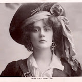
 In 1906 actress Florence Smithson took Rotary to court to prevent the company from publishing photos of her taken by A. E. Chandler of Exeter. The reasons why she didn’t want the photos used might have something to do with her not being paid any rights. We don’t know how the case turned out – the press quickly lost interest in following it – but if it was a rights issue then effectively she had none. Chandler may have paid her for the privilege of taking her portrait; that was common practice among the minor studios but once he had secured the images – prints and negatives – were his. When the Rapid Photo Company came up with the design for this card, it could have asked photographers like Chandler for any portraits. Only if Ms Smithson was appearing in a popular play would the company have snapped up her portrait. Even a major star like Sarah Bernhardt, at the bottom right, wasn’t likely to get a cent from this postcard even if it sold in the thousands. Behind these cheerful scenes lay some ruthless negotiating. 


Here’s a card from the rival Philco Company, interesting because it tells us as much about collecting as it does about how postcards were made. Like Rotary, Philco didn’t take any portraits but paid for existing ones. By setting the faces in a puzzle it was encouraging people to collect a whole set, here of the missing word series. Another card in the collection is identical to this save the message in the middle. 


 And here is a card copyrighted by Ralph Dunn, a photographer working out of 63 Barbican. Notice how the same portrait of Gertie Millar is used in the Philco card. It’s possible that Dunn took the original then sold rights to Philco but it is just as likely both bought rights from a third party. If that was the case, Dunn was making a claim on the idea of having Ms Millar jump out of a Christmas cracker. 

 
 Here’s another of Dunn’s postcards. He liked the surreal effects of photo-montage. Despite his claims to copyright, Dunn has liberally borrowed from Reutlinger, especially in this image. We ought not feel too much outrage given Reutlinger took a liberal attitude to borrowing himself. Mr Dunn was also taken by the idea of actresses popping out of things; as no doubt were many like-minded elderly gents.

 
 If the messages on the backs of these cards are any guide, the most serious collectors of postcards were young women. In the Flossie card below one young lady asks another specifically how her collection is coming along. But back to Lucy. The moon, the stars, the beautiful actresses making up the name: we are in the land of dreamy dreams, a pre-Freudian world where all things and all thoughts need only be beautiful. 

 
The idea of cramming the typography with portraits of actresses may not have originated with Rotary but it became something of a signature. Two things are happening here. The first is that the viewer is quietly impressed with the trickery; it’s like watching a magic show knowing all along you’re being played with. The second is that the collectors inevitably try to identify the actresses, which is another way of saying they intellectually engage with the images. 
No one is called Flossie anymore; even cats won’t answer to the name. 


Our final card is a tribute to an unaccredited designer’s eye and an example of why this era was destined to be brief. While the idea is not original there are dozens of individual photographic images sure to make some assistant’s week a nightmare while a recipient was bound to spend hours gazing at every detail. Excellent, on both counts, but at the same time we can see an aesthetic straddling the last dull edge of the Victorian age and the cleaner, sharper post-war modernism with some discomfort.
 
WRITTEN IN THE STARS

Friday, 7 August 2015

THE IMPORTANCE OF BEING EARNEST


Real photo postcards from the Edwardian stage
“Romance at short notice was her specialty.” 
Saki; The Open Window


 Real photo postcards of actresses are one of the enduring legacies of the Edwardian era; ‘enduring’ to mean lasting although the general impression from a recent visit to the Spitalfields Market was that interminable would be more apt. Not surprising when you read how many thousands of millions of postcards were published then sent each year of the 1900s and how photos of stage actresses were far and above the most popular category in Britain. But amidst the glut of portraits of women in ubiquitous broad-brimmed, feathery hats and puffy blouses, with their stiff composures and curiously sexless expressions, there are occasional images that catch the eye. Just about every one of Hettie King will do that. She was one of several actresses who made an art of male impersonation. It seems that while transvestitism among the citizenry could always create an absolute scandal in the late Victorian and Edwardian era, gender impersonation in the theatre was a specialized skill and in demand, with none of the connotations of sexual or political transgression apparent today.  Of course, Ms King was a comic actress: she played the man for laughs, and laughs in the Edwardian theatre were often of the double entendre type.


It was already a convention in pantomime that the crotchety widow or the scheming stepmother was played by a man; this was comedy after all. When J. M. Barrie’s play Peter Pan debuted in 1904 it was standard for the lead character to be played by a young actress. The play’s subtitle was the boy who wouldn’t grow up and gender ambiguity was a useful metaphor for somebody trapped in a physical and emotional cocoon. Zena Dare was one of the first actresses to play Peter Pan. Here she is as Napoleon, another comedic role for which the English typically cast women. Well that must have stung Gallic pride, or perhaps not since the Paris music halls had long taken cross-dressing to places the English theatre nervously avoided. 


 Zena Dare is one of those people, like Gabrielle Ray. Lily Elsie and Marie Studholme, who were prolifically photographed for postcards in the 1900s yet whose name barely stirs a hint of recognition today. This is inevitable when we think of the thousands of actresses and advances in technology since the 1900s, yet it might be also reflect a particularly British attitude. Where the French loved scandal and their theatre stars made the most of that, over the Channel the female artistes were presented as having much more sensible private lives. If the reputations of Cléo de Mérode and Caroline Otero live on it is for their behaviour off-stage whereas someone who enjoyed a few years in the West End limelight then married well and retired from the stage to cross breed apples on the Sussex Downs would at best be damned with faint praise by being heralded as a national treasure. 

                       
 Not everyone was so apparently blessed. During the first decade of the last century, Gabrielle Ray was reckoned to be the most photographed woman in the world. Though she was acclaimed as an actress and dancer, a look at her résumé suggests she wasn’t being called to play Lady Macbeth or Juliet or any of the other roles that defined a special talent. It may have been her looks alone that attracted so much attention, in which case her tragedy was as typical as it was awful. Agents, directors, producers – especially fat, white and ugly ones – can love a face without caring what lies behind. Even a casual reading of Ray’s biographical details suggests her alcoholism had something to do with her being marketed for her face not her acting. In 1936 she suffered yet another breakdown and spent the rest of her life – all thirty seven years of it – in psychiatric institutions.
Here’s a good quote from Ray found on the Footlight Notes page. As she makes clear, kissing was fun in 1906, but not as much as tearing about the countryside in a motor car: I have done a lot of motoring, but very little kissing. At the same time, I think it would be a pity to discourage those who like kissing because it seems to please them very much. If I have by accident kissed anyone I have never heard any complaint about my mouths; but there, you see, I put cream on my face when going out in a motor-car, because before I used to do so the wind made my face very dry.”


 We’ll get back to the subjects but we can’t ignore the photographers: William Downey and his son Daniel, Alexander Bassano, the sisters Rita Martin and Lallie Charles (previously discussed HERE) and Francis Foulsham and Arthur Banfield, whose work Cecil Beaton dismissed as “rather quaint in (its) woodenness”. To be fair, that same criticism could have been levelled at most of the photographers, and to be fair again, it wasn’t always their fault. You get the impression with some people that they couldn’t make the intellectual jump between appearing on stage and before a still camera. Maud Jeffries was an international star, pulling in full houses from London to New York to Sydney, especially for the faux biblical epic The Sign of the Cross. You wouldn’t know it from this image. She looks like someone shoved a papier-mâché crucifix in her hands and told her to look fearful of the Lord. This inability to perform for the camera is a common complaint from the period, and comes from photographers, producers and actors. Numerous Edwardian performers will spurn the cinema while others will take it on and fail. The typical explanation is that the actor needs the human presence, the applause and even the heckling, in order to perform. 

 
 Being a photographer to the stars carried responsibilities. The studios above also photographed royalty and anyone else who required an official portrait. What mattered most to their non-theatrical subjects – royals, politicians, etc – was that there be no surprises. Politicians showed gravitas, the prince dignity. They were expected to be a lot more creative with stage performers, which could be hard when the process was a treadmill. Faced with a client list of several dozen performers, each demanding the special touch, even the best photographers could exhaust their repertoire. In the same way, some tricks could startle at first but quickly became clichéd. Phyllis Dare was Zena Dare’s sister. Born in 1890, she began acting when she was nine and by the time she was fifteen was a star in light comedies. When she was seventeen (around the time this photo was taken) she published her autobiography and became one of the first in a long line of juvenile performers to author a necessarily thin and vacuous account of a life so far unlived. The title was From School to Stage, which sounds like it covered everything.

 
 For some of us, the very definition of a perfect Friday afternoon involves sitting down with a pile of century old directories and tracking down long forgotten photographic studios. No matter what joys the exercise holds, there are times when running into brick walls becomes tiring. Who was Kilpatrick? It was usual though not compulsory to attribute the photographer or studio on the postcard but Rotary, which published the card, only licensed the image. There was a studio belonging to a Kilpatrick in Dublin and if Ms Studholme travelled to that city for a performance and the studio paid to photograph her, it could have sold the image on to Rotary. Given that Ms Studholme performed in America and what the English quaintly refer to as ‘the colonies’, the studio could have been anywhere in the English speaking world. Her costume here looks Wagnerian, but operetta rather than opera. 

 
 Here’s another minor mystery. This portrait of Lily Brayton is credited to Johnston and Hoffman, recognized as one of the leading studios at the time – in Calcutta. The National Portrait Gallery in London have 52 portraits by the company in their archives, mostly of theatrical stars. Either we are talking about two companies having the same name or Johnston and Hoffmann opened a branch in London. The latter seems more likely, but if so you’d think that would warrant a mention in the entries found in various encyclopaedias. Once again we have a case of the gender role reversals and while there is a passably interesting history of women dressing as eighteenth century highwaymen, what’s really interesting about this is that we see a really professional use of electric lighting. This was uncommon in the early 1900s. Electric lighting was still too expensive for a lot of studios and even those who could afford it needed to relearn photography to understand how to use it properly. 

 
 Dover Street Studios are another commonly encountered name. Interesting that among a dozen or so sighted, variations on the Gibson girl look are prominent. It looks like the studio had an agenda. The GG’s identifying features were her hairstyle and the long, tight dress or gown, both seen here in Ms Gertie Sinclair. It was actually a North American fashion. The graphic artist who designed the look, Charles Dana Gibson, wanted to capture the essence of the ideal American women, whose very modernness he attributed to a composite of cultural ethnicities and attitudes. I don’t know how successfully the Gibson Girl caught on in Britain.

 
 The cabbage is a nice touch. Here Ms Millar wears the costermonger’s outfit that inspired the original pearly kings and queens, Like Peter Pan, Aladdin was an obviously male figure commonly played by women and the musical, The New Aladdin transplanted the oriental story to London. 

 
 Here’s a well-known study of the Moores, theatrical family of course, of whom Decima and Eva became the best known. As discussed in the post on Rita Martin, the relationship between the theatrical world and the suffragettes was more convoluted than you might think, and thanks in no small part to the suffragettes habit of throwing gas bombs into theatres and ruining performances. The Moores however were firmly behind the movement to give women the vote and were among the founders of the Actresses’ Franchise League, which among other activities produced the plays, How the Vote was Won and Votes for Women. I want to say more but do the research yourself. It’s worth the effort.

 
 And here is Eva Moore with her son in an image that is strange on several levels though in Edwardian England it would have met with widespread approval. These portraits of actresses with their children are more than commonplace. They are a reminder of the sharp distinction between London and Paris, where it was advisable for an actress not to indicate she had a family. They were also a protest against the popular image of the stage as the home of outcasts and other ne’er do wells. How better to show the world that the theatre was not only glamorous but also respectable than by showing actress mums with their kids. Except of course that young Master Moore looks miserable, as you might if Mum had made you put on a clown costume then dragged you before a camera.

 
 There are of course many postcards of male actors and there is a world waiting to be read in the differences between the two, but let’s end with an image of one of the best known female impersonators of the age, Malcolm Scott. Like Hettie King, his choice of role was no indication of his orientation and it seems he lived an otherwise ordinary life with wife and family in the suburbs. What’s to like about this photo of course is its various assumptions. We are told that is Mr Scott but we don’t know for sure. For all we know it could be Hettie King playing Malcolm Scott playing Hettie King; a conundrum we think made perfect sense to the Edwardians. We are lucky that so many of these photographs lie scattered throughout flea markets in abundance. In an age when some people think they can charge small fortunes for snapshots they didn’t take but bought for 25 cents, it’s great to have so many images from the Edwardian theatre, a world that is both familiar and disruptive.


THE IMPORTANCE OF BEING EARNEST

Friday, 9 January 2015

IMAGE/TEXT

A (very) brief history of typography, design and real photo postcards
“Design can be art. Design can be aesthetics. Design is so simple, that's why it is so complicated.” 
Paul Rand


A statistic from 1903 tells us that an average of 1 446 938 postcards were mailed in Germany every day that year (You have to love German precision). Basic maths tells us that was in the vicinity of 376 203 880 for that year, and given a certain percent of the population of 56 000 000 were too old, too young or had no interest, clearly some people were very busy. Not all the postcards were photographic but 1903 was also the year that the real photographic postcard emerged as the latest fashion in mail culture. It seems that images of stage actresses were the most popular but so were postcards that amateur photographers made themselves, and then there were images like these, where studios and publishers took current ideas in design and transformed them into photographs. It’s not hard to see why: the only reasons a studio wouldn’t embrace the new process were that it was too expensive or that the studio had established some success with the half-tone process, and neither made much sense businesswise considering those figures from Germany. This card with its obvious religious message comes from an unidentified studio. Though the message is in French the studio could have been based in Germany: studios were never constrained by political boundaries. It could have been running a profitable line in soft porn images as well. With the kind of money involved in the photographic postcard trade, it paid to be pragmatic. If there were a market across the border for Catholic imagery a hard headed Lutheran in Berlin would have no trouble responding to it.

 
John Beagles & Co was one of the most prolific publishers of photographic postcards in Britain up to the 1930s and specialized in stage stars. This was published before World War 1 so the idea of remembrance is uncertain. The tulips (?) generally refer to love – which makes sense in an image filled with beautiful women – and the horseshoe of course means luck, but ‘remembrance’ normally implies mourning and while it wouldn’t be strange to publish a series of cards intended to be sent to the recently bereaved it would be odd to design such a card filled with a collage of famous actresses. Possibly it refers to John Beagles himself, who died in 1909. The company could have produced a series commemorating its founder showing portraits from some of its best known cards.


 Barnstaple is a small town in Devon, which at the beginning of the last century only had a developing reputation as a tourist destination. The postcard was published by J. Welch & Sons of Portsmouth. If the publishers were using templates sourced from elsewhere they may have had little to do with the design of the finished product and may not have even supplied the scenes of the town. The motifs could have been used for any town in Britain and it is also possible that the letters with their collages of women and girls were created elsewhere. The price for a photographic postcard in England was a penny and even though some are on record as selling in the hundreds of thousands, it’s unlikely that Welch & Sons would invest any time on the typography for a card selling in small town Barnstaple. Note the collage of the girls and women. It is a feature that can always date a postcard to being pre World War 1; not because the war had anything to do with it but because fashions changed.

 
 No account of typography and design in photo postcards can be complete without examples from the Reutlinger studio. They produced the most sophisticated examples and dominated the French market. A comparison with the Barnstaple card is enough to show why. Even though the studio mass produced images and recycled the photographs - this portrait of Gilda D’Arthy would appear on at least half a dozen other designs - there was always a sense that if the postcard wasn’t unique it was different. This comes from a series employing the Art Nouveau typography and featuring a woman against the backdrop of a lake. Together the letters spell out ‘Reutlinger’ and the idea was for people to collect the full set. Another statistic from 1903 indicates that of the nearly 200 000 000 postcards bought in Britain that year, only a quarter were posted. The real market lay with collectors and the trick was to make sure they always returned to buy more. 

 
 Postmarked 1930 but most likely produced in the 1920s, this Freudian double entendre urging Dad to use his cane and repopulate France was a response to the huge loss of life in the First World War and the 1918 flu epidemic, which together accounted for over two million deaths, or around five percent of the population. Even before the turn of the century, France’s population had been considered too low for full economic prosperity. It wouldn’t fully stabilize until the 1960s, when with independence millions of immigrants from former colonies in Africa and the Middle East arrived. We don’t know how successful this campaign was but it’s doubtful Mum would have been too thrilled at the prospect of thirteen children. 

    
 The Rose Stereograph Company was founded in Melbourne in the 1880s by George Rose, a man who realized that for a stereographic company to thrive it needed international scenes and the best way to get them was to do the travelling himself. By the 1920s the market for stereographs was in decline and the company turned to producing postcards. Mostly, it appears, the postcards were standard topographical scenes but this is an inspired example of what could be achieved with a little imagination. I can’t say I’ve seen anything else quite like it and the inclusion of the waratah with the eucalyptus flowers suggests the template may have been particular to the company and not sourced from elsewhere. Note the sign on the building at the right for Martin and Pleasance Homeopathic Pharmacy. Like the Rose Postcard Company, it is still in business.  

 
 From the 1930s onwards the strongest challenge to the real photo postcard came from brightly coloured linen cards and in the U.S the Curt Teich Company ruled that roost. There’s good research on the company with stories of a small army of salesmen travelling desert highways and offering lonely gas stations and motels such tempting ideas as the addition of a couple of girls in bikinis to the image at little extra cost. The large letter linen postcard with the name of the place, town or city writ large is a distinctly American vernacular. Large letter photo postcards are not as common though in some ways they are much better. The photos in this postcard were taken by the Nevada Photo Service but we are more interested in the illustrations. Lew Hymek was a newspaper cartoonist in Reno during the 1930s and 40s, the era when the town suddenly boomed on account of relaxed gambling, and divorce laws before mob town Las Vegas took all the attention. Obviously there was a collaboration between Hymek and Lawrence Engel, who operated the Nevada Photo Service, and because this is a photographic postcard it could have been produced and published by the Nevada Photo Service. A linen card version would need to be sent to somewhere like Curt Teich that had the printing technology. This is better than a linen card because it displays Hymek’s skills and it has that cowboy glamour we associate with Reno when North Virginia St was still worth visiting.

IMAGE/TEXT

Thursday, 11 December 2014

MY FAIR LADY


Rita Martin; a forgotten photographer
“These pictures are the acme of artificiality and as far removed from nature … as a hat trimmed with artificial summer fruits.”
Cecil Beaton


 All the photographs in this post are of Lily Brayton, the beautiful and celebrated star of Shakespearean drama in the Edwardian era, but she is not the focus. That belongs to Rita Martin, the London portrait photographer who was one of the best known in Britain at the time but is strangely neglected today. It is not unusual to encounter photographers who were household names in their time yet don’t crack a mention in any of the encyclopaedias, but what makes Ms Martin’s case special is that where she does get attention it is for the high standard of her work and her innovative techniques: two qualities you’d think historians would have picked up on.

 
 The facts are these: she was born Margareta Weir Martin in Ireland in 1875 and died in 1958. According to the photoLondon Database her studio was at 74 Baker Street, Marylebone, a mile or so away from the studio of her better-known sister Lallie Charles in Curzon Street, Mayfair. The addresses were in exclusive neighbourhoods. A photo by Lallie Charles in the National Portrait Gallery database shows the two women and their sister Bea in what was probably Lallie’s studio C1899. The furnishings and décor are what we would expect of a high-end studio of the age: a distinct oriental element in the screens, rugs and vases, potted ferns (or are they lilies?) and dark, elaborately tooled tables and chairs. The women have that dreamy gaze we associate with the late-Victorian era; as though life in this room is too achingly elegant to risk leaving it. In 1975 Cecil Beaton co-authored with Gail Buckland a personal history of photography, The Magic Mirror, to which he added an appendix; Commercial Photographers of the Victorian and Edwardian Era. Like the other appendices it accounted for photographers who hadn’t fitted with the general theme of the book. Rita Martin and Lallie Charles were given more attention than anyone else in this section. There’s a sense reading it that Beaton knew Martin - not Charles: she died in 1919 - particularly when he intimates that the sisters fell out. It reads like gossip he received first hand.  

 
 The quote from Beaton at the top however comes from his book British Photographers, part of the Britain in Pictures series published by William Collins during World War II. Each thin volume contained a short essay by a noted authority and thirty or so reproductions of artworks in colour and black and white. The topics ranged from butterflies to canals to a history of fashion: all of them intended to remind people of what was too precious to let fall into the hands of the Germans. Beaton’s contribution included one of his famous scenes of Saint Paul’s Cathedral during the blitz. Given the brief amount of space Beaton was allowed, that he would give more attention to Rita Martin than he would to Lewis Carroll or Roger Fenton may seem surprising, but when you look at his early work especially it is clear that Martin and Charles had defined for him what studio portraiture could achieve. For Beaton, artificiality is a compliment. In The Magic Mirror he says of both sisters that “they transcended the stereotyped (and) showed a tyranny over their subjects, who were willing to do their bidding, for they knew they were being beautified”. Beaton could be describing his own working methods. During the first decade of the twentieth century, photographic postcards of stage actresses were popular around the world. Most studios placed the subject before an elaborate stage backdrop, emphasizing the theatricality above the performer. Rita Martin preferred to place her women in a stark setting that obliged the viewer to consider their stage presence.

 
 Lallie Charles was a photographer of the royal family and made her name more as a society photographer. To understand how she and her sister developed their styles and reputations, we need to consider Alice Hughes, one of the most formidable presences on London’s late-Victorian photographic scene. She would not photograph men. You might think taking this stand at the beginning of the suffragette era would marginalize her, but around the turn of the century her studio was so popular with society women and stage stars that she employed up to sixty assistants; again, none of them men. Lallie Charles was probably one (this is unclear) but the more important point is that Hughes rejected the standard sepia, Pictorialist view for the very expensive, beautifully rendered platinum prints in sharp focus. One of the criticisms of Pictorialism, then and now, was that the photographers frequently confused artistic excellence with vapid sentimentality. A soft focus view of a society lady admiring a tulip might sound like a good idea in theory but the result could make her look as fascinating as a blade of grass in a paddock. Charles and Martin took Hughes’ ideas and when it came to publishing postcards saw the virtue in refining them, reducing background interference, or removing it altogether. Their success however owed as much to their ability to impart or inspire a performance for the camera, something few actors were seriously expected to do.

 
 According to Beaton, Martin had a contract with the theatre manager George Edwardes that gave her exclusive rights to photograph Lily Elsie and other performers once a month. This may not be entirely accurate, or may have only existed for a short time, because other studios photographed Ms Elsie. One was Foulsham and Banfield, whose work Beaton waspishly described as “rather quaint in their woodenness”. The general impression is that all power resided with management. Edwardes could agree to such a contract, as long as Ms Martin kept her fees to a figure he thought was reasonable. More likely, a successful performer like Lily Brayton had enough influence to ask for Rita Martin, and if sales of postcards justified her demands Edwardes would agree. 

 
 Although Ms Martin photographed several leading men of the stage, of the 322 prints held by the National Portrait Gallery, only three are of men alone, though a couple more are of men with their families. The number of prints is enough to be representative and suggests that like Alice Hughes, Ms Martin had principles she couldn’t be persuaded from. The first instinct is to say these were political, but on second thoughts it may have been that she was essentially interested in glamour. That wasn’t a word many male actors would have wanted to be associated with in the 1910s or actually applied to them. It implied an interest in haute couture and other womanly pursuits. When you look through lists of images of male Edwardian actors, they tend to go for either comedy or dashing but respectable, and were typecast as one or the other. Lily Brayton on the other hand could wear costumes from across the centuries and cultures and still transmit an aura of chic allure. For a photographer of the stage, male actors were boring.

 
 According to the NPG website, Lallie Charles photographed some of the suffragettes. Rita Martin photographed Rosamund Massy from the National Women’s Social and Political Union. What does this mean? Were they sympathisers? Were they asked to because they were well-known women photographers? Was it because, like Lily Brayton, the suffragettes were part of the cultural milieu? None of these questions cancels another so the answer may be all three but it’s worth remembering that while London’s theatre world might have been thought progressive, there wasn’t a huge amount of sympathy for the suffragettes. The actress and singer Anna Held complained that they went about slapping men and when they started setting fire to theatres and letting off smoke bombs inside that predictably turned people off them. Rita Martin may have believed that women had the right to vote and agreed to photograph some of the suffragettes but that didn’t mean she was obliged to like any of them.    

 
 Which brings us to the important issue of why she has been forgotten. It isn’t as though her work is hard to find, and she was well enough known in the 1940s for Beaton to assume his readers needed no formal introduction to her. It’s one thing to discover a previously unknown photographer, vis-a-vis Vivian Maier, but when a photographer has a substantial body of work in an archive the neglect is not random. Perhaps, like her sister, she’s seen as too establishment, too Edwardian, and her portraits of theatre stars don’t cast a challenging light on the social history. But the photo-historian’s first job should be to write the history, not re-write it and clearly there are spaces that need filling in. A common myth about early theatre portraits is that they were perfunctory commercial jobs and the genre didn’t take off until a handful of photographers in the 1930s (Beaton in particular) introduced an individual style. If that is the case, these portraits of Lily Brayton reveal a relationship between photographer and subject that was decades ahead of its time.


MY FAIR LADY

Tuesday, 21 October 2014

WINGS OF DESIRE


Transgressive images from Weimar cinema
 "I’m sincere in my preference for men’s clothes. I do not wear them to be sensational. I think I am much more alluring in these clothes."
Marlene Dietrich


 Berlin in the Weimar years: a city rampant with leather wrapped, cross-dressing S&M fetishists, or not. Depending on whom you ask (or what you read), that image is either an invention or a conflation. There were bars like the Silhouette, where a customer could take a table and watch a parade of men in make-up and dresses and women in tuxedos, but reliable advice suggests most of the night spots were a lot tamer than that. Apparently we can thank films like The Night Porter and Cabaret for seizing on a rumour and treating it as fact. If the Nazis were perverts by definition, it was assumed that for night time amusements they’d prefer watching a couple of transvestites spanking each other rather than a blonde fraulein singing banal operetta, but when you think it through, the latter is darker, stranger and altogether more disturbing. One of the hallmarks of the Nazi leadership was an abject lack of imagination. These were people who dreamed of a world where everyone shared their passion for kitsch, which meant blonde girls in gingham singing folk songs, not sexual ambiguity. Goodbye to Berlin, Christopher Isherwood’s original book on which Cabaret was based has no scenes set in a cabaret, but can we really blame Michael York and Dirk Bogarde for helping create the enduring image of Berlin C1930? Not entirely. Thanks to the Ross Verlag postcards we have thousands of surviving images that show the photo studios pushed the idea of a city where taboos were broken as a daily habit. Yet, coming from the cinema world, they were images of what the world could be, not what it was. Lya de Putti’s attire may have looked fabulous but it was impractical, and it was easier to imagine a world where women strolled along the Kurfürstendamm in sheer, glistening black rather than live in one where they actually did. After all, for a lot of ordinary citizens struggling with hyperinflation and massive unemployment, to dress like Ms Putti does in this photo was like waving a red flag at a National Socialist rally. The photograph is by M. I. Boris, aka the Bulgarian Boris Majdrakoff, who arrived in New York in the 1920s with a past respectable thriller writers would have dismissed as too unlikely. 

 
 Look at contemporary fashion images of women wearing suits and ties and we are meant to think of them as daring experiments in gender reversal, but so many of the Ross postcards show women wearing men’s clothing, or a close approximation, that we realize they were a trend back in 1920s and ‘30s Berlin. What makes us think they are about playing a game rather than making a statement is that so many of the actresses portrayed did not have reputations for challenging convention. From what we know of Carola Tölle, she played solid roles in films that are largely forgotten because there is no compelling reason to remember them. Her private life can’t be accounted for but it appears scandal free.

 
 Henny Porten’s fame and reputation have endured, for her roles as a gentle or long suffering earth mother type. Comparing the photo of her with that of Ms Tölle, we begin to see a pattern, or rather, a style. Only a decade earlier the notion of a woman wearing a suit and tie would have still caused a stir. In 1919 however, German women won the right to vote.  What had changed had less to do with Weimar Berlin’s free thinking than fashion designers’ understanding of how to accommodate radical into chic. Ms Porten’s sleeveless waistcoat has a decidedly feminine cut. She is not wearing a business suit. In the 1970s Diane Keaton revived the suited look in Annie Hall. If it didn’t make the jump to the pages of Vogue that was because it was too idiosyncratic: it was one thing to look like Diane Keaton, another to look like Annie Hall. And maybe the crusty old editors at the magazines took one glance, recalled their youth in Vienna wearing Papa’s silk ties and thought it had all been done before.

 
 Having never seen Marcella Albani in a film, commenting on her strengths as an actress is pointless, but in every other photograph of her in the collection she is portrayed as the embodiment of graceful elegance; a woman with a preference for haut couture and intelligent conversation. That doesn’t mean she lacked a sense of humour. When she fronted up to the studio on this particular day, she might well have been bored with the idea of yet another soft focus study suggesting she had just emanated from the mists. Perhaps Herr Binder was bored too and together they concocted an image the very opposite of what was expected. She was an actress; it was her job to be out of character. 

 
 Russian born Hella Moja dressed as a baroque era noble (or Mozart) looks to be having the last word on androgyny here, and in a way she is. We know from photographs by Walery and Reutlinger that the Ancien Regime look was popular around the Parisian music halls a generation before Karl Schenker took this portrait. So too were the matador, the Gypsy and even the blacksmith. They were too exaggerated to be subversive, more like fancy dress, and never began with the premise that other women might want to dress that way in the street. Also, it was always more acceptable for women to dress as men than the other way around. How many of the leading male stars were willing to don corsets and bustles?

 
 Sigmund Freud’s nephew Edward Bernays famously turned up in the U.S and turned women on to smoking. He took his lead from home, where the habit was already associated with modern sophistication, added a bit of volume and general crassness and earned the undying gratitude of his employers. A lot of the Ross postcards show women smoking; by the mid 1920s a cigarette in the hand was a sign of elegance, of adulthood, but not necessarily of rebellion. Ms Haake’s forte was light comedies and socially concerned dramas and she’d go on to a long career, appearing in films into the 1980s. If the idea of a woman smoking was as scandalous in Germany as it was in America, she’d be one who’d put hers out before the photographer was ready with the camera.

  Not so Fern Andra, the great, unsung heroine of early cinema. American born but European by preference, she promoted herself as a woman who liked a cigarette and a stiff drink and would be disappointed by any man who did not offer her both. In reality she was an intensely serious worker who understood the dangerous gulf between public image and private life. She paid a price, but not for smoking or dressing in men’s clothing or any of the standard contraventions. As actor, director, producer and even photographer, she controlled her image so closely that when it began to fade no one was on hand to help her revive it.

 
 Which brings us to that most infamous figure of the early screen, the vamp. Her modern history began with the nineteenth century music halls, she came of age with silent film and died with its passing. It was difficult to be a real vamp in the 1930s. The Hays Code in Hollywood was very much opposed to any young woman who thought a man’s marriage was a speed hump not a stop sign. According to the new rules she had to pay for her crimes, which was an obligation no genuine vamp ever considered. The Nazis weren’t keen on her either. For all the bondage and S&M imagery bestowed upon them, publicly their ideal woman was blonde, virtuous and enthusiastic about the outdoor life. She could suffer but never inflict pain herself. The vamp was dark, saturnine and came alive when the sun went down, like Valerie Boothby in this image from Iris cards. Despite her very English name, Ms Boothby was German. Her career was short but included such titles as Girls on the Cross (1929), Adam and Eve (1928) Inherited Passions (1929) and Marriage in Name Only (1930); all which suggest some poor fool learns a lesson about love the hard way. 

  The vamp and the femme fatale were subtly different creatures; though the man who fell victim to either was seldom astute enough to know that. Both depended on exploiting male vulnerabilities but where the first was essentially amoral the second had principles and objectives. Sometimes she was looking for a way out and figured the man would lead her to it, and sometimes she was genuinely in love with him. If the last scene saw the vamp heading down the street with a man in her arm, you knew they were going back to her lair. If it was the femme fatale on the other hand, she may well have been persuaded that the path to true happiness lay in marriage, children and a home in the suburbs. Lissi Arna is one of the many German actresses of the silent screen forgotten now by all but the most devoted fans of the era, yet throughout the 1920s she was one of Weimar cinema’s most popular stars. Her reputation today, such as it is, rests on several films where she played the prostitute (hard hitting exposé) or the seductress (comedy, melodrama) but as it transpires she made more of the routine romances that were the bread and butter of the film business. The Kiesel Studio was located at Kurfürstendamm 11, meaning the address was fashionable but real information beyond that is hard to find. Alongside the celebrity portraits are many more showing children with oversized Easter eggs, or (that other inexplicably popular genre) dressed as their parents. What we see here is one of those minor shifts in the way women were portrayed that don’t raise the number of eyebrows today that they should. There is nothing vulnerable in Ms Arna’s expression. She knows what she wants and how to get it. 

  The secret had less to do with women discovering an independent spirit than technicians realizing the power of lighting. Photographers were learning that a shift in angle to throw a shadow could do more than animate a portrait. It could transform Elizza La Porta, generally sensible star of such morally didactic films as The Right of the Unborn and The Vice of Humanity (abortion and drugs respectively) into a siren of the night. Silent Hollywood gave the vamp fame and notoriety but in Los Angeles she was a European construction. Think of the number of famous Hollywood mantraps from the silent era, how many have ‘European’ names, and what their actual names were: Theda Bara (Theodora Goodman), Dita Naldi (Mary Dooley), Olga Petrova (Muriel Harding). She was by definition exotic because part of the danger of becoming involved with her lay in being unable to penetrate her closed, enigmatic mind. In Germany, America was a strange, distant land (witness the popularity of Karl May’s Native American novels), but so too were places just beyond its borders. The Balkans, home of the vampire, Oriental Turkey and the Arab lands, the Russian steppes; they were all breeding grounds for women who could crush a man’s soul with as much thought and effort as it took to flick a cigarette into the gutter. Romanian born Elizza La Porta may not have played the seductress on screen but she knew how to for the Manasse studio. Operated by Olga Solarics and Adorjan von Wlassics, it specialized in glamour photography and in surreal, modernist erotica. After years of relative neglect, the erotica was rediscovered and in the process became representative of decadent Berlin. The studio was equally adept at portraying actresses as sweet and wholesome as a strudel. But any fool with a camera can do that.

WINGS OF DESIRE