And furthermore ...

One Man's Treasure encourages the use of anonymous photographs posted here to illustrate books and album covers.
If an image appeals to you, contact John Toohey at johntoohey@hotmail.com.
Showing posts with label ephemera. Show all posts

Friday, 29 January 2016

ON HINDSIGHT

Artistic cabinet card back stamps
“I'm afraid that if you look at a thing long enough, it loses all of its meaning.”
Andy Warhol


 These days, when the word ‘art’ can mean pretty much what you want it to, some of us might feel nostalgic for the 19th century, when the word had a very precise definition. Or so we like to think. It turns out our great, great or merely great grandparents were just as vague on the subject. To them, ‘art’ didn’t necessarily carry a value judgment; it could refer to pictures in general, which is to say any pictures regardless of their quality. An artist was someone who made pictures. Of course they had artists – people of questionable morals and hygiene who couldn’t keep a proper job – but if a sign painter called himself an artist no one was going to correct him. In Nashua, New Hampshire, Joseph Gauthier advertised himself as an art photographer and to emphasize his credentials had the landscape on the easel. The mountain could be Mt Adams or Washington in New Hampshire, but it could as easily be a generic mountain. You’ll notice the palette and the brush at the bottom of the canvas. The logic suggests the painting is being completed while we watch.

 
 Thomas Donovan of Brighton and Boak and Sons of Malton and Driffield are just two other English studios that used this same back stamp. A glance at the bottom left shows it was produced by the printing firm Marion of Paris. The woman is supposed to be a figure from the Italian Renaissance but, given the period this was produced, we could also think of her as pre-Raphaelite. Note the ivy, a plant that has had numerous symbolic meanings throughout English history, some erotic and others more cerebral. What of the snake unwinding upon the vase? The first thought is that it is a nod to Genesis, but why? 

 
 There is little immediate information on the Curtis Art Gallery, most likely located in upstate New York, but we can imagine the kind of art that hung on its walls. Apart from views of Niagara Falls, we could expect a few mildly pictorialist scenes among the Currier & Ives type prints and a few still lifes. The clue is in the Japanese fan sticking out of the vase in the bottom right. C1880s the inclusion of Japanese elements in any kind of pictorial design was a nod to art: not the high art the Renaissance as in the first backstamp but an indication that the producer had a rarified and sensitive outlook. This was an era when drinking Japanese tea out of small bowls was a mark of wealth and sophistication.

 
 The acknowledgement to Japan is more explicit here in the umbrella. Again it is also a design by Marion, now of London as well as Paris. You’ll notice that, like Spence Lees and Curtis, J Maclardy offers services as a portrait painter. On the backs of CDVs sighted on Ebay, MacLardy says he or she also paints on ivory. That would be miniature ivory portraits. Although at this time (1880s) the idea of the artist as a member of the avant garde was being recognized, it would be churlish to argue that Maclardy was not an artist.

 
 P. Drew is Alfred Palmer Drew. The Cabinet Card Gallery has some information on him, including the tragic destruction of his studio in 1896. For now we are only interested in the rather excellent back stamp. Although it doesn’t carry a printer’s name it is hard to believe that Drew would go to the expense of producing this on his own. An earlier post discussed the putti (as the cherubs are properly called) and their unclear symbolism. Here as usual there’s a suggestion they are up to mischief. Note how the one at the top is about to pull the sheet from the easel, so revealing the painting underneath, but the camera nearby indicates it will actually be a photograph. You’ll also notice that the little thug at the bottom has upset a frame and allowed a photo to fall out, so presumably advertising the fact that customers can have their portraits framed as well.

 
 Two more putti, common enough on back stamps so we need not pay too much attention except that the one at the top wears an apron with the sun as a crest, telling us he or she an emissary from the sun or is the agent ultimately creating the photograph. The photo is from Bulgaria but the stamp was produced by Bernhard Vachs (?) of Vienna. There’s an evocation of Greek mythology here; of the putti caught up in a shroud discarded by Demeter, goddess of fertility, or even her daughter Persephone, associated with Spring.

 
This elegant design also has allusions to Greece and also the Orient, but it is the two ships that catch our eye. Smith’s Falls is on the Rideau River but these ships are on a somewhat larger body of water, the closest to the town being Lake Ontario, which is some distance away.  It’s proof if we want it that the back stamp need not bear any relation to the photographer’s business or philosophy. John Moore either consulted a catalogue or he found an ad in a photographic magazine, but when he saw this design he liked it at once.

 
Finally, we come to Paul Darby, whose claim to fame, such as it is, was that he photographed James Joyce at his graduation in 1902. We don’t know whether Darby was Irish, French or British but we can see that by century’s turn he has embraced the design and typography of Art Nouveau; well who wouldn’t. to be an artistic photographer was as much about being wise to contemporary fashion as it was about being up with ideas in painting and sculpture. The idea of purity, of suffering for art had caught on around Montmartre but over on the Boulevard de Strasbourg hunger and struggle were the last things anyone would admit to.


ON HINDSIGHT

Friday, 13 November 2015

THE BACK COUNTRY


Back stamps and design on cartes de visite and cabinet cards.
 “Of all of our inventions for mass communication, pictures still speak the most universally understood language.”
Walt Disney


For some people, the pleasure in collecting cartes de visite and cabinet cards lies entirely on the reverse, in the stamps that identify the studio and sometimes advertise the range of services. This is understandable. The images on the other side are often commonplace and uninteresting while the back carries an intricate design that can also be a code. This stamp on the back of a cabinet card from the Phebus studio in Constantinople is dominated by Apollo, the god of the sun and of light – AKA Phoebus Apollo - an obvious choice for a photographic studio. Apollo could also be a god of truth, which again makes sense for a photographic studio, since that was what they purported to offer. Note the idealized Ottoman script at the top and the French Photographie. Without knowing who runs the studio we can tell from the French that he was Armenian, because French was the lingua franca of the Armenia business community in Constantinople. Sure enough, Phebus was run by Boğos Tarkulyan, one of the better known photographers in town around the turn of last century. The Art Nouveau pattern was a deliberate nod to contemporary ideas in Western Europe, identifying Tarkulyan as someone less, or even not, interested in Ottoman traditions. The choice of flower in the frames at the top would have been conscious too. It may be amaryllis, which has some connection with Apollo, but that’s only a guess.

 
 The study of the backs of CDVs and cabinet cards is a branch of iconography, specifically one that can trace its origins back to the frontispieces found in books from the sixteenth century through to the beginning of the nineteenth. The frontispiece could be a declaration of intent or an acknowledgement of a patron’s greatness but were never just random images. It was intended to be read in minute detail and required knowledge of biblical imagery as well as more demotic symbols. By the 1860s, when this carte was produced, the art and meaning of frontispieces had fallen out of use but Theophile Gastonguay evoked them with the image of a beaver. Although the beaver did not become the official emblem of Canada until 1975, it had been commonly used as a symbol of Canada since the seventeenth century.

 
 Archibald McDonald ran a photography studio in Melbourne throughout the gold rush. Like every other studio photographer in Melbourne at this time he came from another country, from Nova Scotia in fact, just a spit away (in Canadian distances) from Theophile Gastonguay. You might wonder why St George and not a kangaroo but there we see the difference a century and a half of colonization can make. Although by the 1860s people around the world recognized the kangaroo as Australian, it wasn’t a national symbol. Australia (AKA “The Colonies”) didn’t have such a thing, or if it did it was likely to be St George’s dragon, which, like Australia, was proudly British. Archibald McDonald: logic tells us he was of Scottish background and he might have been the type to give a Glasgow kiss to anyone who called him British, but St George here doesn’t stand for England so much as a landmark in Melbourne. Long gone now, once upon a time everyone in Melbourne knew where St George’s Hall was.

 
 A similar thinking may have been behind Louis of Paris’s depiction of the Porte St Martin, which then as today was close by the central shopping district. Firstly it told customers the studio was located in one of the more salubrious areas, and then it told them how to get there. Notice it was opposite the Theatre de l’Ambigu, a place made famous by Louis Daguerre’s set designs.


Migevant’s studio may not have been at such a desirable address as Louis’ but no Parisian had to ask where the Place de la Bastille was. When this CDV was produced in the early 1870s there couldn’t have been too many people around who remembered the Revolution and the storming of the Bastille in 1789 but enough would have recalled the glorious revolution of 1830, which the July Monument seen here honoured. Essentially the French replaced one monarch with another, which is a little like stumbling from one failed relationship with a drunken philanderer straight into another. Today the Boulevarde Beaumarchais is lined with shops selling antique cameras.


The back stamp can be evidence. In 1876 Alfred Mayman took over the Temple Photographic Gallery at 170 Fleet St in London. Two years later the City of London dismantled the Temple Bar on account of Fleet Street needing widening and the structure was dilapidated. The sections were carefully stored and in 1880 Henry Meux bought it and reassembled it on his estate in Hertfordshire. In 1984 it was bought back from Meux’s descendants and re-erected in Paternoster Square. All this to say that there was only a two year period between 1876 and 1878 when there was any practical purpose for Mayman to have an illustration of the structure on the back of his CDVs. We don’t need any other information to date the image.  

 
 Images of cherubs with cameras are common, as is the inclusion of an artist’s palette, but what does it mean? Strictly speaking, these round and flabby infant creatures are Putti: cherubs have several heads and bits of eagle and lion attached to them. The precise symbolic meaning of the Putti is not understood but since the late Renaissance they have had an association with the arts, and music in particular. Originally the true artist had his muse, a goddess, who inspired him and for whom he created. The little toddlers might have been intended to suggest the playfulness every serious artist needs but also, babies were the inevitable result of creative coupling. In the way that a red and blue barber’s poles once indicated a place to have a bit of bloodletting and these days means a haircut, Monge, and every other photographer who used the imagery saw it as an icon not a symbol.

 
 Just to reinforce the point (somewhat), we find exactly the same image on the reverse of a CDV by a studio located on Rue de la Sabliere. The companies that printed the blanks for CDVs usually have their name in small letters down the bottom. We don’t get any such on either Monge or the Sabliere studio card and while we could assume the same company produced the blanks, it is also possible that several bought their designs from another source. Somebody could have produced this image of the putto, sold it on to the printers who then customized it for the various studios who used them.  

 
This palette is also very common, with a fairly obvious interpretation although it ought to be pointed out that few commercial photographers thought of themselves as artists in the way that people used that word even in the relatively staid 1860s. ‘Artist’ was a kind of password for quality of technique rather than ideas. Apart from being a photographer, Camille Benoit was an art dealer, so he may have seen the image as a pun. 


 Harrison Nathaniel Rudd ran his studio in Costa Rica around the turn of last century, as board mounted photographs were giving way to postcards. Costa Rica was relatively prosperous and peaceful at this time, meaning an American could operate a studio with some confidence it would not be closed down or he would have to get out at short notice. This rather elegant design may have also come from a template customized to his requirements. Or not. There is a pun here as well, in the idea of the woman’s hand holding out a carte or cabinet card. A camera is depicted at the top of the crest.  Maybe Rudd also had cartes with the same back design that the hand holds out.


THE BACK COUNTRY

Thursday, 28 May 2015

TRUTH AND CONSEQUENCES

Discarded sequences
“Murderers will try to recall the sequence of events, they will remember exactly what they did just before and just after. But they can never remember the actual moment of killing. This is why they will always leave a clue.”
Peter Ackroyd


 Sequences of photos snipped from proof sheets, cut out of albums or otherwise cast off, leaving us with what may be mysteries, or not, or clues to a bigger story, or not. Murderers may always leave clues, but so do photographers. The problem is that they seldom tell us what to. Notice how these two images above move from a kind of order to a kind of chaos, suggesting some force outside the photographer’s control is at work.


 All of these were bought Turkey, which explains one or two details in the scenes. Other than for those however, they could have been taken anywhere. This zoo for example doesn’t look Turkish (except for the lion’s tiny cage). Sometimes we are able to read a very apparent narrative in a sequence, as with some below where people are playing for the camera, and then there are others like this one that tell a story like some French film from the mid-sixties; well there might be a plot and it could be logical, but should you care that much?

 
 So, is this five photos or just one? I say it is one because you can not consider any of the portraits here on its own without physically cutting it free from the others. 

 
 This one on the other hand is interesting because all snapshots taken at Giza are interesting, yet I think the middle photo stands up on its own and the two bookending it do not. Remove them and the surviving image is not diminished. 


Here the photos complement each other thanks to the way the child on the right looks at itself on the left. We can see how the photographer would have been pleased with either and printed the proof to compare them. The one on the right wins because of the balance between light and shadow.


Four photos – or do we mean two? – of the same three people. There’s a strong impression here that the three are actors, because they perform so professionally for the camera. The printing isn’t first rate but good enough to see how each frame has its own intriguing details, from the floating hat in one to the expression on the faces of the man and woman in another. 


It’s not rare to read that the source of many snapshots’ enigmatic quality is the absence of a surrounding context, without which we cannot understand the relationship between photographer and subject. Here’s a sequence that is all the more difficult to read because of its surrounding context. We get the three women sitting together, but what of the first photo in the sequence? The radio makes sense, and the book on the left is a medical encyclopaedia, which may help us understand the cut out naked woman on the right, but that is a mere assumption.


Back to a diptych from the same source as the first image, and a reminder of that brief era between the late 1960s and the mid 1970s when the combination of two images on the same panel was considered outré, or at least cool. Robert Frank is the best known exponent and he liked to include a cryptic text on one or both photos. What was good about this style, movement, genre or whatever word fits best, was the way it obliged us to look for and think about the connection. We ended up talking about it, and though the conversations could have been lifted from Annie Hall, their absence is noted these days. In this case we might note how the two women appear in both while the person in the centre is different. During the long and tedious 1990s-2000s the placement of two images together could only mean issues of identity or the self, but in the 1970s the photographer could shrug and say, ‘whatever you see is there’.

TRUTH AND CONSEQUENCES

Sunday, 12 January 2014

A BRIEF HISTORY OF BRITAIN

British history recorded in the ephemera of postcards, snapshots, cigarette cards and miniature views
“Poets make the best topographers.”
W.G. Hoskins


In the beginning it looked like this. Britain was born out of earthquakes, tsunamis and storms powerful enough to cleave mountains in two. Some of the events that shaped the British Isles happened overnight. Geologists think the creation of the English Channel was one such event. A massive storm tore through and shattered the Weald-Artois Anticline, a broad, natural bridge that joined Britain to the continent. The next day mammoths and giant elk looked out across a broad expanse of water, then they went back to grazing.
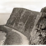
When this photograph was taken of the Devon coast near Clovelly, circa 1930, geologists had a different conception. Shaking off religious notions of everything happening in seven days, they preferred to believe in a process that could take hundreds of thousands of years of gentle erosion. Now we are coming back towards that old idea; that a powerful force could create the landscape overnight, only these days we know it wasn’t God but nature.  


Britain really begins with Stonehenge. We know next to nothing about the people who built it, except they were the first to alter the landscape in any meaningful way and they weren’t Celts and didn’t have druids. Even the name we used to give them, the Windmill Hill culture, is considered imprecise now. Were their ancestors the same people who dug pits to trap mammoths then fell in themselves, giving modern day palaeontologists a lifetime’s work? Or did they sail over from the continent later on little boats built from birch sticks and deer hide?
This postcard was published by the Office of Works, probably in the 1930s, but before 1941. Astonishingly, compared to what we know about Stonehenge now, in the 1930s our understanding of the structure had not progressed much since John Aubrey began investigating the ruins in the 1650s.  Archaeologists went to pains to insist there was no druidic connection although they couldn’t say with surety who did build it. Around the time this postcard came out however, Paul Nash was also taking photographs of Stonehenge. To him, the thick, angular forms were a perfect expression of modernism. Forget Paris; if you wanted to be part of the English avant-garde, Stonehenge was the place to start.


Thanks to the Welsh, the Cornish, the Irish and a handful of feisty Scots, Celtic is still a living language. It is the rootstock of British culture. If the Glastonbury hippy and the Birmingham skinhead could agree one point: without the Celts they would be nothing, or else French. As the survival of the language testifies, the Celts never went away, they became Romans, then Anglo-Saxons, Normans, took one side or the other in the War of the Roses and eventually some voted for the Tories in the last election, some didn’t.
This snapshot was taken under Saint Piran’s Cross in Cornwall, some time in the 1930s. Saint Piran is the patron saint of Cornwall and of tinsmiths. It is an early Celtic cross and before erosion set in it bore intricate carved designs. Fifty years before this photo was taken, Cornish was in danger of vanishing but in the 1890s Henry Jenner published the first modern dictionary and actively promoted the dying culture. By the time this was snapped the language had been revived and was out of danger. It comes from a family album from a holiday on the south coast including several scenes of Tintagel, reputed home of the reputed Arthur. Was the father rediscovering his Cornish heritage? Was he inculcating his daughters with the idea they were English, but Cornish first?


Let’s skip the Romans. They built roads and Hadrian’s Wall but north of that they had little impact. Besides, they wrote everything down so there is little mystery about them. The Anglo Saxons are more intriguing. It used to be believed that they invaded like a pack of soccer hooligans on to a pitch but all sorts of evidence; sites that prove they were buried alongside original inhabitants and indications that the language was willingly absorbed, suggest otherwise. They still look like long-haired smelly brutes from Germany. It is interesting how every BBC documentary about the Anglo-Saxons feels obliged to state from the beginning that the Angles and their enigmatic relatives the Jutes were magnificent artisans and wrote some beautiful poetry. Yes, but if you’ve ever sat in a room with a sculptor or a poet you’ll appreciate they can emit some pretty toxic fumes while blathering on about their place in history. Odour and creativity aren’t even relative.
This cigarette card shows the Weald in about 1920. Amazingly, it didn’t look so different circa 600 AD. But before then it was reckoned to be a dense forest. The Anglo Saxons are either credited or blamed for the clearances. The effect hasn’t been properly measured but there are indications that the flooding and the collapse of settlements around Romney Marsh in the Middle Ages may have had something to do with this early example of ecological overkill. What we got in return however was a part of England that seems, well, so English. Think of a thatched cottage, some black faced sheep and an old gaffer in a tweed coat muttering about the weather and you are probably thinking of the Weald. 


You don’t have to be English to know that in 1066 the Normans invaded. These descendants of Vikings apparently introduced some sophistication to the place – if you prefer ‘re-introduced’ that is fine. Anyway, they spoke French and Latin and knew that if you were going to roast a whole pig on the spit an apple in the mouth improved the flavour. We give them credit for a whole new concept of law, the development of literary culture from the guttural to the written word and the Bayeux Tapestry, which is in France. Wordsworth and other poets found something of the romantic English soul in the ruins of Tintern Abbey, which makes sense in an odd way if you bear in mind this monastery became a ruin after one of those periods that has really defined England for historians; the dissolution of the monasteries and the trashing of the Church’s power base.
This cigarette card is hand-painted, a detail that should not be overlooked. The hand colouring is a little untidy but you can see how the person behind it tried to create some sense of mystery of the place. The light falling on the walls for example suggests the sky was more likely to be an insipid blue than a moody grey.


Actual medieval England was a wonderful place; up to 50 public holidays a year and if you didn’t like your rental arrangement you could head off to the forest to live the life of an outlaw, poaching the local noble’s deer or wild boar when you were hungry and drinking gallons of mead every night. If you could play the lute there was a fair chance said noble’s daughter would call you to her window and suggest running off to France. Not to worry: she spoke the language; she even had a brother over there, who hated his father more than you did.
Leonard Wiseman Horner lived in Hastings and photographed around Sussex in the 1930s. If commercial photography ever had a romantic movement, he belonged to it. The intention wasn’t just to photograph medieval villages and buildings as any good documentary photographer would but to suggest that nothing had changed in 600 years. It was late Pictorialism for the masses and though it appeared to be presenting a response to history that the heritage councils advocated it was undermining it. This was history for people who thought Robin Hood and Errol Flynn were the same person.


There are a lot of myths attached to the Long Walk leading to Windsor Castle, one being that Henry VIII wandered pensively along it while waiting for news of Anne Boleyn’s execution: somewhat unlikely given it was laid out 150 years after her death. Charles II was behind the walk, and given he seems to have spent most of his time wenching in a state of intoxication, the idea of a long avenue for constitutional strolls is both sensible and an extravagance. The real purpose probably was to rival the architectural designs of Louis XIV of France. The two mile long avenue held the splendours of the castle in the traveller’s gaze and inspired the proper dignity.
In 1860 Roger Fenton took the most famous photograph of the Long Walk. He may have directly influenced others to take their photos from the same point of view but there are really few alternatives for the photographer who wants to show the length in all its glory. This miniature snapshot from an unidentified set of views comes from an album full of such photos. It wasn’t uncommon for people to collect wallets of miniature views and put them in albums. It didn't mean they had visited a place but they had visited an idea. In this case, the English landscape was sculptured by men and women of high aesthetics and ideas.


The British Empire was founded on rum, sodomy and the lash. Credit for establishing it belongs to the Tudors but it was the later Georgians who turned it into the buttress of empire.
At first glance this could be a scene many English people would have witnessed in the 18th and 19th centuries, a tall ship taking out the poor against their will out to the colonies but there is more than meets the eye. It is the Herzogin Cecilie, a German windjammer built in 1904. After World War I the ship was part of the reparations Germany paid to France, then it was sold to Finnish shipping magnate Gustaf Erikson. He used it to ship wheat from Australia to Europe because well into the 1930s sail was still cheaper than steam for long voyages. On April 25 1936 the ship struck rocks off the Devon coast and foundered. On January 18 the next year she finally sank. We can see the ship is listing in this snapshot. I think the person who took this photo was thinking of Captain Cook, William Bligh or south coast smugglers.


Before the 1830s the moors had been useful land for grazing, a bit too rugged for crops perhaps but no one ever set foot on them fearful they might get lost if they wandered off the path. Then a generation of writers emerged for whom the best time to visit the moors was in late autumn when the weather was foul and nature, cruel mistress that she was, could signify the torment of unrequited love with a stiff breeze.
Harrogate sits close to the most famous of literary moors, those in Yorkshire where Emily Bronte set Wuthering Heights. Thanks to Ms Bronte the Yorkshire moors cannot be depicted without dark clouds and the ruins of a stone cottage somewhere in the scene. This postcard gives a different impression. Scrubby and unfit for farming some parts might be, but they are not all desolate. And as this scene shows; wander off one path and another will soon appear.


Recall the first image of the sheer cliffs of the Devon coast as stark evidence of how Britain’s geography was born in violence. There is speculation that the same force that shattered the anticline and created the English Channel had the simultaneous effect of pushing parts of the coastline up, hence the cliffs of Dover. A little further around we are at Beachy Head in Eastbourne. The lighthouse was built during the last days of Victoria’s reign and is one of those triumphs of late 19th century engineering. Essentially, it was constructed from the cliffs using cable cars. Presumably the water around the spit of rock it was built on was too small and too rough for the builders to work on it.
Fred Judge pumped out thousands of postcards between the early 1900s and the Second World War. They are often dismissed for lacking originality or anything like an interesting take on their subject although they also attract collectors with a near fanatical passion for them. This is a typical Judge’s postcard and while there is nothing unique about the composition it has an undeniable atmosphere. Photographs don’t have to challenge us to work.  


A BRIEF HISTORY OF BRITAIN

Sunday, 15 September 2013

SQUARE WORLDS 2


10 snapshots taken with a 127 camera
 "Attend to your configuration."
Edwin A. Abbott. Flatland.


The square is the most self-contained shape. Unlike the circle, the triangle or the rectangle, it makes no allowances for anything that exists outside its perimeters. Whatever intrudes is welcome but it has no extension, no existence really, beyond the square. Maybe that is why square was always regarded as a format for amateurs. Few professionals specialized in or preferred the square format, mostly because of its limitations. If editorial work required a square frame it was just as easy to photograph using a standard rectangular format and crop as it was to shoot square.


In 1912 Kodak introduced 127 roll film for its folding vest camera. Originally it was in a rectangular format measuring 3x4 cm, which was smaller than more common formats such as 120 but still large enough to get a decent contact print. All Kodak cameras were designed for the amateur market and 127 was always regarded as an amateur format. Though some later cameras might have sophisticated features such as a focusing ring or a choice of three aperture settings, a 127 camera would always be identified by its contemporary design and the materials it was made out of – Bakelite, die cast metal and moulded plastic. For some collectors, 127 cameras like the Kodak Brownie and the Ensign Ful-Vue rank among the most beautiful cameras ever built, regardless of their technical shortcomings.    


One of the perceived disadvantages of 127 was that in its rectangular format it only allowed for 8 frames. By making the cameras square format this allowed for 12 frames, or four more photos. Manuals were full of advice on how to compose a photo for a rectangular format; use the rule of thirds, make sure the background is interesting and so on. With square format it was simple. So long as the subject was in the centre, or close enough, it was hard to go wrong. 


Most 127 cameras relied on a single meniscus lens, usually made out of plastic. Rather than just bad, results tended to be variable. A camera that functioned well in bright daylight failed that test when a flash was attached to it. Sometimes one frame came out with perfect clarity while the next was ruined by light flares or poor focus. Two models of the same camera could have different qualities, one getting the background in reasonably sharp focus, the other recording it as bleached and muddy. This is of course why devotees still love the 127, and not just for its unpredictability, it gets effects they couldn’t emulate in the darkroom. 


During the 1980s Hong Kong companies began producing Holga cameras, essentially exercises in nostalgia. What people liked about them; their abberant focus, the way some colours were saturated and others washed out and the effect that produced a dark vignette around the border. The camera manufacturers started building these features in so the photographer could always be guaranteed of getting the Holga look. Later, photo editing apps like Creative Kit offered the Holga and Lomo options. This involved ramping up the contrast, softening the appearance, saturating reds and adding the vignette. This can make ordinary images look more interesting but Holga, Lomo and the editing apps miss one point; the real magic of amateur cameras lay in their unpredictability. To be assured of getting the Holga look is self-defeating.   


The photos in this post were taken with a 127 format camera in Quebec sometime between the mid 1940s and ‘50s. (The church is identified as being in Ste Victoire, between Montreal and Quebec City.)  The shots using flash in particular show up the camera’s limitations but they also have an atmosphere we couldn’t get from a better machine. We couldn’t get it from a modern toy camera like a Lomo either. That comes down to the difference between being natural and self-conscious. The photographer may have known some photos wouldn’t record the scene as he or she saw it but that was no reason not to take a photo, the point being to record a moment. Half a century on, Holga and Lomo photographers know what they are after and arrange the scene to get it. When you look at several of them at one sitting you can leave with the feeling they are not celebrating anti-professionalism or even a considered aesthetic so much as a visual pretence.

SQUARE WORLDS 2

Saturday, 7 September 2013

MAN WITH A MOVIE CAMERA

  Itinerant film still photographers
 “The film drama is the opium of the people…down with bourgeois fairy-tale scenarios…long live life as it is!” 
Dziga Vertov


There’s a long history of commercial street photographers who worked city centres taking candid snaps of pedestrians and selling them the prints, and it’s only just started to catch the attention of photo-historians. As a genre it is related to restaurant photographers, who the historians have also only recently begun examining. In both cases the photographs themselves are rarely as interesting as the idea that semi-itinerant photographers were shooting the inhabitants of our cities as they walked to the office or the department store or sitting down to dinner. A vast record of our parents and grandparents lies scattered and underappreciated among collections and archives. If you want to know what Dublin was like in the mid-20th century, you could look in a lot of places but the photos of Arthur Fields, who hustled on the O’Connell Bridge for fifty years, might tell you more than a selection of beautiful prints of beautiful buildings (You can see some of his work at Jacolette here). Within that huge and unruly world there is a sub-genre that deserves its own place in the history. Working alongside, even competing against the regular street photographers were a small group carrying portable 16mm cameras who set the shutter on single image and took ‘movie snaps’. There are only two examples in the collection and an envelope advertising the service, but they come from Istanbul, Perth Australia and Toronto, so we know the idea was worldwide.


This one is credited to the Filmograph Company, located at 378 Murray St Perth. A quick look on the internet reveals similar photos from the same company being taken in Brisbane and Christchurch, New Zealand in the 1930s. It’s hard to believe a company survived let alone conquered Oceania on the singular idea that people would want a candid sequence of themselves walking along the street. The feeling is this was just a sideline and the real business was probably in film processing or editing though we’re ready to stand corrected. After all, some of the street photographers in the US were operating franchises for national companies. 


This is the front of the envelope from Movie Snaps in Toronto. The phrasing; ‘As you walked along we have just taken a moving picture of you’ suggests it was spontaneous and the subject had little idea they were being filmed. On the back it reads, “Remember, your photo has been taken.” Is it just our age of CCTV cameras on the street corner and internet surveillance or would that have sounded just a little like a threat back then as well? The company is reminding potential customers that we don’t just have your image; we have your movements on our files.
There’s also the reminder that the print will be ready in 48 hours. As a commercial proposition this sounds risky, relying on pedestrians to first of all be interested and then care enough to turn up two days later. 


Note how the price on the front is 25 cents and on the back we find that a postcard enlargement costs 35 cents. There’s a little bit of deception going on here. The 25 cents print is probably small and cropped. The 35 cents postcard is the one you would really want, plus the copies. It wasn’t a huge amount of money back then, according to records 35 cents could get you a sandwich or a cup of coffee at a diner in the mid 1930s, but that was enough to pass on the offer if things were tight.
These companies didn’t offer portraits. They are so small and indistinct that when the clients turned up two days later they could be forgiven for wondering if that was actually them under the big hat.  Movie Snaps’ language implied that you might not get to Hollywood though here was an idea of what you’d look like if you did yet that is just sales pitch. The idea, the gimmick of sequential images only worked so long as motion pictures were still mysterious and exclusive. People still found them fascinating. Standard 8 home movie film was around in the early 1930s but that was about people having fun at barbecues and distant fuzzy figures chasing footballs on a school oval: home movies weren’t really popular until the 1960s when Super 8 was released. When these were taken it was a little like the early days of photography. The customers found the process fascinating because they didn’t quite understand it.

MAN WITH A MOVIE CAMERA