And furthermore ...

One Man's Treasure encourages the use of anonymous photographs posted here to illustrate books and album covers.
If an image appeals to you, contact John Toohey at johntoohey@hotmail.com.
Showing posts with label hand-colouring. Show all posts

Sunday, 29 May 2016

ANCIENT HISTORY


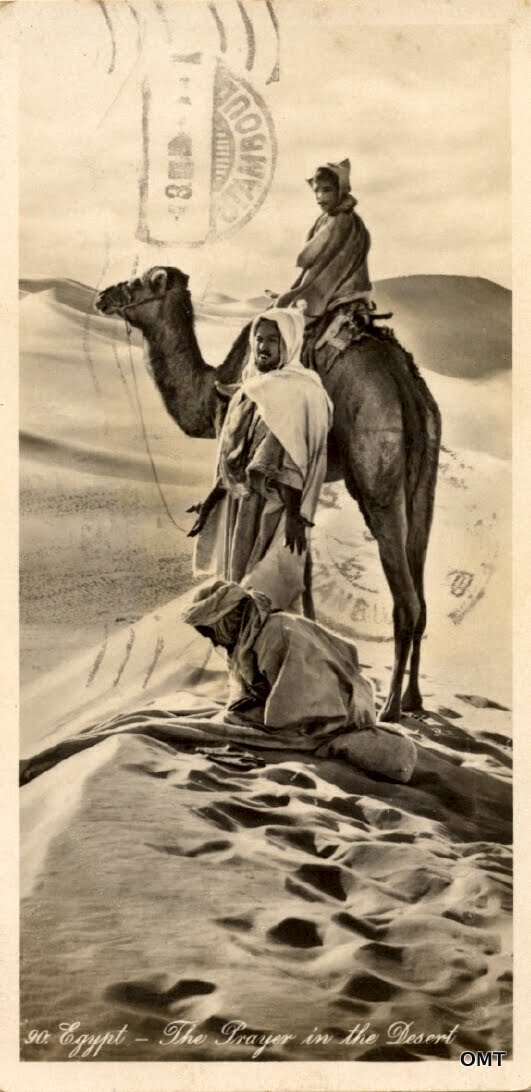
Panoramic postcards of Egypt by Lehnert & Landrock
“Give me my robe, put on my crown; I have immortal longings in me.”
Shakespeare: Antony and Cleopatra


 When Rudolph Lehnert and Ernest Landrock moved their photographic studio from Tunis to Cairo in 1924 they were announcing to anyone listening that Egypt’s capital was also the cultural capital of the Middle East. Not that they decided this: the year before, Howard Carter and his team had broken into Tutankhamen’s tomb and Ancient Egypt had once again become the most exciting idea on the planet. In far off Hastings, builders excavating a basement discovered some odd glyphs in a dingy tunnel and for a moment the theory that ancient Egyptians or Phoenicians had visited the place was kicked around. The place called Ancient Egypt, or at least the idea of it, had seldom been out of fashion’s eye in the last fifty years but now it was back centre stage. There were at least half a dozen other companies in Cairo producing real photo postcards for the European market but Lehnert & Landrock would become the best known.

 
 Lehnert, the photographer, had certainly worked in Egypt before the company opened shop there but once it did, business flourished. We can think of its halcyon years as coming between 1924 and the beginning of the war. Although a great enthusiasm among the British for German product seems unpatriotic, even love of country has its limits. There was a booming international market for shots of L&L’s most renowned genre: nude Bedouin women, and the British were driving demand as much as anyone else. But anyway, we’re not here to talk about that, or even more dubious genres the company marketed but rather the flip side; Egypt as a phenomenon of cultural sophistication.  

 
 From the beginning, postcards were the familiar size by which we know them, approximately 3½ x 6 inches, because they fitted the standard envelopes for informal correspondence. In some countries the laws sounded specific; the post card had to be ‘no more than’ or ‘less than’ or ‘at least’, but this only meant that anything that fitted within the required dimensions was legitimate. Publishers produced midget size and giant size postcards but the most common irregular format was the bookmark size, and though bookmarks of stage stars were popular, landscapes and street views have become the most enduring, especially the bookmark postcards from Cairo that Lehnert and Landrock produced.

 
 One of the company’s achievements was that it managed to make Egypt look how everyone imagined it to be; a land still touched by its ancient past, with oases of palm trees providing shade from which to contemplate the pyramids, maze-like souks, the stalls piled high with ornate rugs and silverware, and watched over by hawk-eyed Muslims. One hundred years ago, the abiding image of Muslims was of devout, silent and impassive people. Of course, not long before in the Sudan and southern parts of Egypt Muslims were fanatics who needed to be suppressed with violence if necessary, but that was now the past. In popular culture the siege of Khartoum was just another heroic chapter in the history of the British Empire.  

 
 From 1882 until 1922 Egypt was officially a British protectorate (and less officially into the 1950s). This explains why Cairo, a city inhabited by Egyptians since 969 CE would have a ‘native quarter’.  This was both a ghetto and a slum – neither being necessarily the same thing – separate from areas occupied by Europeans, Armenians, Alexandrine Greeks, Jews and Ottoman Turks. Egypt at this time, well, until 1914, was also a khedivate of the Ottoman Empire. The condition for Egyptians was something like being the child of two parents whose contempt for each other was outmatched by that for their offspring. Said children are usually destined for a miserable adulthood.

 
Cleopatra, Khartoum, The Greatest Story Ever Told: in the 1960s Egypt became the canvas for epic visions, though ‘bombastic’ might be a better adjective. There’s a suspicion, and maybe nothing more, that one influence was these panoramic views; well they share the same format and there is something about the panorama, no matter how small, that speaks of the vast – in time as well as space. To create this image the studio simply took a standard format negative and cropped what wasn’t needed. There isn’t the distortion a genuine panoramic camera would produce. Still, removing whatever was extraneous and leaving the palms, the camel, the cart and the porter suggests a scene that could take place anytime in the last 200 years. Interestingly this is titled Kasr el Nil Bridge but it may be the one it replaced in 1931, the Kobri el Gezira. Photos of that one have the palms but they are absent in views of the later bridge. 


 The Orientalist argument says that these views tell us more about the consumers than the place, which should be beyond dispute by now, but what after all do they tell us about Cairo? Where, for one thing, are the crowds? Today the city is so densely packed that a view like this one seems impossible even at unlikely hours. Was it really so magically empty in the 1920s? No. As far back at the 1500s, when Europeans began arguing over the biggest, the richest and the most powerful cities in the world, three were inevitably ignored: Peking, Bombay and Cairo. As engines of civilization they were derided, despite the monumental evidence opposing that, and despite the popularity of Ancient Egypt stemming from the great desire of London, Paris, Rome etc to be seen as the inevitable heir to its culture. So no; this is not the vast, hectic and noisy city tourists encountered but somewhere ancient and austere: the place they came to find.


ANCIENT HISTORY

Friday, 4 December 2015

BLACKPOOL ROCK

Postcards of the Blackpool Illuminations
“Reality leaves a lot to the imagination.”
John Lennon


 In November 1879 Thomas Edison applied for a patent for an incandescent light bulb, and as every American school student will tell you, the light globe was born. However, a couple of months before Edison made his application, Blackpool had its first festival of illuminations and coloured lights were strung up along the promenade. The English may remind you that Joseph Swan beat Edison by a year. Edison is famous for inventing things some time after someone else did but this is beside the point. Even if Swan’s incandescent globe wasn’t quite practical in 1879, electric lighting existed in various forms and, like the automobile, it was understood that it was only a matter of time before it became practical for every house to have electric lamps. This was reason enough to have a festival.

  During the years before the Second World War Blackpool’s illuminations had become internationally famous. Electric lighting was now commonplace in most cities around the world but the illuminations were a celebration of something more ancient and sacred. Held from mid-September to mid-November, they were a final protest against the steadily shortening days; a rebellion against nature, which, some philosophers argued, was what the modern world was all about. Having subjugated electricity we could defeat the powers of darkness.

 
 As the images here attest (Actually they do something else but we’ll get to that.), Blackpool’s waterfront was transformed into a psychedelic fantasyland of giant butterflies, gondolas, stagecoaches, fish, devils and flowery biplanes. It all looks very wonderful, which is where the problems arise.

 
 Every year the Valentine’s Company sent out a photographer, probably local to Blackpool, to photograph the lights so the results could be turned into postcards. The initial results would have been drab. The images were in black and white and the discrepancies between light and shadow were so extreme that some areas were either horribly over or under exposed. Even when standing under bright lighting shutter speeds needed to be slow. Obviously, straight photographic representations were out. Fortunately, the Valentine’s Company had never placed much value on straight photography.

Even before real photo postcards emerged in the 1900s, James Valentine’s company had treated the negative as a mere starting point in the process of creating a final image. Beginning and end did not need anything more in common. That attitude was the norm. Very few commercial photographers in 1905 would have argued there was something sacred about a negative. 

 
 Still, it needed to be the foundation of the image. For the postcards from the Blackpool Illuminations, the predominant features in the scene had to be intact, so here the photographer snapped a gondola and sailboat in the pool in front of the bath house, with Chinese lanterns strung across the water and the fairground in the distance. The people in the foreground were also there, the one to the left just entering the scene. That however was the extent to any veracity. Taking the people as the starting point, they may have been within a brightly illuminated area but only very slow film of around 800 ASA and higher would have had the capacity to freeze them in motion. What if however, the photograph was taken at dusk, just after the lights came on but before the sun set? The people in the retouching studio would have had no trouble creating the impression of night.

 
It is no coincidence that where it appears in each of these photos the moon is full and approximately the same size as it emerges from the clouds. It is apparent that it is artificial, a detail Valentine’s wouldn’t have tried to hide. It is that moon against a dark sky that tells us this is nighttime. Everything else could be photographed at dusk and then enhanced with colour.

 
 The decision to use hand-colouring probably wasn’t difficult to make but it was what distinguished the images. Blackpool became lurid and almost grotesque. Of course, the intention was not to strive for authenticity but aspire to the impression created by the illuminations. Pastels were out of the question. The colours had to be vivid, even though it meant that some scenes, like this one, have a sinister quality. 


During World War 1 many British women found themselves working in factories doing incredibly detailed work such as painting in badges and royal seals on military equipment. When the war ended, the factories (on behalf of the government) sacked them. Meanwhile, tobacco companies, postcard publishers etc suddenly needed people who knew how to work in miniature. Much as the boss might want to employ his nephew, young Roger, with his medals, his one arm and his ruined lungs, Roger’s wife, Bessie, who had spent the last four years painting numbers on shell casings was both more able and better qualified. She was re-employed, though rarely on terms that suggested there was something dignified about her labour. Her wages barely paid for Roger’s Player’s Navy Cut and aspirin. Along with rubbish wages, she put up with standing in a line along with dozens of other wives of war veterans, monotonously applying specks of colour to postcards like this, all the time inhaling toxins that would have put an elephant to sleep. Bessie’s work was every bit as dirty, as monotonous and as dangerous as Roger’s had been. But I digress. What’s also worth thinking about is that despite the production line, hand colouring made each of these images unique. We can see some slippage in this postcard, especially along the strings of lights. Despite thousands of the same postcard being printed, that mistake made this like no other.

 
 This postcard was most likely not published by Valentine’s. The suspicion is that the original negative was under-exposed, which wasn’t an impediment. When the outlines were enhanced a strange scene with this crowd of shadowy figures was created. Once the living of Blackpool retire indoors, the dead arise to wander about in a state of dulled curiosity.

 
When these photos were taken electricity was still a hallmark of progress, which could be boasted from the crest of the street car. We can’t be absolutely certain when these postcards were produced but we can wonder who though electricity was still a sign of progress after WW2 with its rocket attacks and atom bombs. In any case, once again we get a spectral atmosphere from the brightly lit but empty interior of the car. Who said ghosts have to be monochrome?

 
We understand the image of Blackpool being created by these images, yet in this final scene the impression is almost the opposite. Brightly lit, yes, but also eerily deserted and joyless. In the bottom right a figure hurries from a taxi towards a café, which also looks empty. Blackpool is like a town in a Robert Aickman story, where everything looks in place except that one, nagging absence, which in this case turns about to be any other sign of life.

BLACKPOOL ROCK

Friday, 9 January 2015

IMAGE/TEXT

A (very) brief history of typography, design and real photo postcards
“Design can be art. Design can be aesthetics. Design is so simple, that's why it is so complicated.” 
Paul Rand


A statistic from 1903 tells us that an average of 1 446 938 postcards were mailed in Germany every day that year (You have to love German precision). Basic maths tells us that was in the vicinity of 376 203 880 for that year, and given a certain percent of the population of 56 000 000 were too old, too young or had no interest, clearly some people were very busy. Not all the postcards were photographic but 1903 was also the year that the real photographic postcard emerged as the latest fashion in mail culture. It seems that images of stage actresses were the most popular but so were postcards that amateur photographers made themselves, and then there were images like these, where studios and publishers took current ideas in design and transformed them into photographs. It’s not hard to see why: the only reasons a studio wouldn’t embrace the new process were that it was too expensive or that the studio had established some success with the half-tone process, and neither made much sense businesswise considering those figures from Germany. This card with its obvious religious message comes from an unidentified studio. Though the message is in French the studio could have been based in Germany: studios were never constrained by political boundaries. It could have been running a profitable line in soft porn images as well. With the kind of money involved in the photographic postcard trade, it paid to be pragmatic. If there were a market across the border for Catholic imagery a hard headed Lutheran in Berlin would have no trouble responding to it.

 
John Beagles & Co was one of the most prolific publishers of photographic postcards in Britain up to the 1930s and specialized in stage stars. This was published before World War 1 so the idea of remembrance is uncertain. The tulips (?) generally refer to love – which makes sense in an image filled with beautiful women – and the horseshoe of course means luck, but ‘remembrance’ normally implies mourning and while it wouldn’t be strange to publish a series of cards intended to be sent to the recently bereaved it would be odd to design such a card filled with a collage of famous actresses. Possibly it refers to John Beagles himself, who died in 1909. The company could have produced a series commemorating its founder showing portraits from some of its best known cards.


 Barnstaple is a small town in Devon, which at the beginning of the last century only had a developing reputation as a tourist destination. The postcard was published by J. Welch & Sons of Portsmouth. If the publishers were using templates sourced from elsewhere they may have had little to do with the design of the finished product and may not have even supplied the scenes of the town. The motifs could have been used for any town in Britain and it is also possible that the letters with their collages of women and girls were created elsewhere. The price for a photographic postcard in England was a penny and even though some are on record as selling in the hundreds of thousands, it’s unlikely that Welch & Sons would invest any time on the typography for a card selling in small town Barnstaple. Note the collage of the girls and women. It is a feature that can always date a postcard to being pre World War 1; not because the war had anything to do with it but because fashions changed.

 
 No account of typography and design in photo postcards can be complete without examples from the Reutlinger studio. They produced the most sophisticated examples and dominated the French market. A comparison with the Barnstaple card is enough to show why. Even though the studio mass produced images and recycled the photographs - this portrait of Gilda D’Arthy would appear on at least half a dozen other designs - there was always a sense that if the postcard wasn’t unique it was different. This comes from a series employing the Art Nouveau typography and featuring a woman against the backdrop of a lake. Together the letters spell out ‘Reutlinger’ and the idea was for people to collect the full set. Another statistic from 1903 indicates that of the nearly 200 000 000 postcards bought in Britain that year, only a quarter were posted. The real market lay with collectors and the trick was to make sure they always returned to buy more. 

 
 Postmarked 1930 but most likely produced in the 1920s, this Freudian double entendre urging Dad to use his cane and repopulate France was a response to the huge loss of life in the First World War and the 1918 flu epidemic, which together accounted for over two million deaths, or around five percent of the population. Even before the turn of the century, France’s population had been considered too low for full economic prosperity. It wouldn’t fully stabilize until the 1960s, when with independence millions of immigrants from former colonies in Africa and the Middle East arrived. We don’t know how successful this campaign was but it’s doubtful Mum would have been too thrilled at the prospect of thirteen children. 

    
 The Rose Stereograph Company was founded in Melbourne in the 1880s by George Rose, a man who realized that for a stereographic company to thrive it needed international scenes and the best way to get them was to do the travelling himself. By the 1920s the market for stereographs was in decline and the company turned to producing postcards. Mostly, it appears, the postcards were standard topographical scenes but this is an inspired example of what could be achieved with a little imagination. I can’t say I’ve seen anything else quite like it and the inclusion of the waratah with the eucalyptus flowers suggests the template may have been particular to the company and not sourced from elsewhere. Note the sign on the building at the right for Martin and Pleasance Homeopathic Pharmacy. Like the Rose Postcard Company, it is still in business.  

 
 From the 1930s onwards the strongest challenge to the real photo postcard came from brightly coloured linen cards and in the U.S the Curt Teich Company ruled that roost. There’s good research on the company with stories of a small army of salesmen travelling desert highways and offering lonely gas stations and motels such tempting ideas as the addition of a couple of girls in bikinis to the image at little extra cost. The large letter linen postcard with the name of the place, town or city writ large is a distinctly American vernacular. Large letter photo postcards are not as common though in some ways they are much better. The photos in this postcard were taken by the Nevada Photo Service but we are more interested in the illustrations. Lew Hymek was a newspaper cartoonist in Reno during the 1930s and 40s, the era when the town suddenly boomed on account of relaxed gambling, and divorce laws before mob town Las Vegas took all the attention. Obviously there was a collaboration between Hymek and Lawrence Engel, who operated the Nevada Photo Service, and because this is a photographic postcard it could have been produced and published by the Nevada Photo Service. A linen card version would need to be sent to somewhere like Curt Teich that had the printing technology. This is better than a linen card because it displays Hymek’s skills and it has that cowboy glamour we associate with Reno when North Virginia St was still worth visiting.

IMAGE/TEXT

Thursday, 30 October 2014

THIS IS THE MODERN WORLD

Edwardian era fashion postcards 
“Fashion is made to become unfashionable.”
Coco Chanel


 I have been informed, politely and otherwise, that I am unqualified to discuss fashion. It is true that when the words ‘fashion’ and ‘photography’ appear next to one another a yawn needs stifling. It is the least interesting genre, one reason being that it is so pervasive. It is one thing to encounter fashion photography in the cosmetics department at the local pharmacy, another when it turns up in hardware stores, as though using this power drill will bestow some kind of glamour upon us. Also, the genre has run out of ideas. People speak of a golden age of fashion photography that lasted from 1920 to the 1950s, which was a long time ago now.


 This ‘golden age’ began with technological processes that made it possible to reproduce photographs to a high standard in magazines. Previously they had to rely on line drawings. It coincided with the rise of Parisian fashion houses such as Chanel, the diffusion of modernist principles in photography and suffrage for women, which shifted the balance of power so they were not just portrayed as elegant but having authority as well. But if we look to the years immediately before, we discover that the most important medium for transmitting the latest ideas about fashion was the common postcard.

 
 What made the postcard special was that it was cheap, intended to be sent, and also collected. Typical messages on the backs of these postcards from the first two decades of the twentieth century are: “What do you think of this?” (meaning the costume) or: “Here’s another for you”, meaning the recipient – inevitably a young woman - collected fashion postcards. With the popularity of postcards, studios were pumping them out so someone in Paris could send a postcard to someone in London, who got that season’s fashion tips hot off the press. If her mother was relying on Tatler for fashion advice, she might have to wait weeks for what her daughter received in a few days.


Another advantage postcards had over magazines was that they could be hand-coloured. Fashion advice from the era places a lot of emphasis on colour; gowns and robes are not merely green but chartreuse; burgundy is in; vermilion is out. Japan had been a source of inspiration for European designers since at least the 1880s. Japan meant delicate, which itself meant pastel shades rather than bold colours. When Hermann Kiesel’s studio photographed this model, it most likely received specific instructions on what shades of ink to use. 

Despite the postcard publishers promoting fashion, labels are rare to non-existent on the postcards, suggesting that the designer didn’t matter. We know that in the 1910s the fashion house was still emerging as a distinct force but another explanation for the absence is that the outfits on postcards weren’t strictly haute couture but copies. Department stores in New York imported fashion items from Paris but they also copied the designs. If a broad-brimmed hat complete with ostrich feathers and silk bands direct from Paris cost too much for anyone but the wealthy, most middle class women could afford an accurate replica. Also, the market for the postcards belonged to young, unmarried women. We know that because on the back the cards are usually addressed to Miss or Mlle Someone. Actual haute couture was out of their reach financially, and also maturity-wise, since that was supposed to arrive with the debutante ball, or if they couldn’t afford that, marriage.


Which brings us to that borderline between fashion and erotica. The frontier has always been vaguely marked out, given that one is often an intrinsic element of the other, and there are postcards that make us wonder whether the real attraction was the fashion or the impertinence, but young women were supposed to have thresholds. They might have gone for the flapper look, with the cloche hat and the woollen outfit. Showing the suspenders however was perhaps too indecorous. The risk of sending a postcard like this to a friend is that the parents could find it, so casting her in their eyes as an immoral vixen. It isn’t the evidence of the suspenders that would have necessarily caused offence but the woman’s posture. In fashion, a woman’s expression could be sultry, provocative or downright lubricious but her physical pose was always supposed to be demure. 


 In 1931 Jeanne Jullia of France won the Miss Europe beauty contest. Some time later it was discovered that in the 1920s she had posed nude for Julian Mandel, the infamous and mysterious producer of erotic postcards. The revelations created a minor scandal but they were handled with more savoir-faire than they would be today. She was not stripped of her title, bundled off to rehab or made to grovel before the press, probably because a sullied past was nothing to get excited about in 1930s France; everybody had one. As with the designers, the women who appeared in these fashion postcards were unnamed but look at enough postcards and certain faces become familiar. Usually they were actresses or singers without the status to warrant a caption. Although some women worked as professional models the job was so poorly paid it was something they’d do on the side. Like acting, it was still a disreputable occupation for a woman but at least in the theatre she could redeem herself by becoming a star. 


 This card was sent to Mlle Sarah Parent at 1197 St Catherine St Montreal on April 25 1907 and asks if she can still come to the theatre that evening. (Mail was commonly delivered three times a day back then, which is why you can find postcards mailed from Brighton to London arranging to meet that afternoon.) A Sarah Parent turns us in the Quebec records as born in 1893. If this is the same Sarah, she fits the profile. At fourteen she would be going to the theatre with friends and have an interest in fashion. Notice that the girl in the photo is only a few years older, about eighteen; in other words, a suitable role model. This was sent at the height of the fashion postcard era. That ended with the First World War. It wasn’t so much that the war created a break in the culture but that the customers grew up. Post war, Sarah Parent would be twenty five, possibly married and if she were still interested in fashion she would be turning to the magazines that were aimed at older women. Like the extravagant Edwardian hats, fashion postcards belonged to the past.

THIS IS THE MODERN WORLD

Sunday, 27 April 2014

BRIEF LIVES


Portraits of forgotten stars who died young

“One short sleep past, we wake eternally,
And Death shall be no more; Death, thou shalt die.”
John Donne


The history of the silent cinema is littered with young corpses, especially suicides. A very few achieved a kind of immortality through dying: Rudolph Valentino springs immediately to mind, but for most who died young, death brought more than a figurative long silence. They were soon forgotten. It is unfair to expect people born decades after they died to remember who they were, but fame, we are told, is somehow eternal. And we are so often being asked to imagine perpetually sunlit fields where the dead stars wander in a kind of bliss, pausing only to look down upon us indulgently. Among these portraits Pearl White’s is the only name I was familiar with before I bought the photo. Saying that, the image I had of her was of a woman tied to rail tracks as the steam engine bore down, and I cannot remember I saw that in one of her films or got it from Rocky and Bullwinkle. One’s memory doesn’t have gaps so much as rough patches, don’t you find? In any case, Ms White’s story is sad and we should not make light of it. In the early years of silent film she did her own stunts. Having been a bareback rider in the circus she didn’t think much of jumping from heights and rolling out of moving vehicles but she broke bones in the process, with the result that she took to painkillers and alcohol, with the extended result that she died from liver failure aged 49. 


Who today knows anything of Lillian Hall Davis? Not me – at least, not until I found this photo, yet we read that for a time she was one of budding director Alfred Hitchcock’s preferred actresses and starred in his third and fifth films, The Ring and The Farmer’s Wife; films that British cinephiles hold as keys to understanding everything he did that followed.
Some of us can imagine a suicide’s final minutes; the preparation and the execution. What remains utterly mysterious are the days leading up to that; the bleakness, the compact someone makes with themselves. Lillian Hall Davis’s death was particularly horrible. She slashed her wrist and her throat then put her head in a gas oven. Such determination is terrifying.


In the early 1920s Bruno Kastner was a huge star in Germany, with women. Men found it hard to reconcile his attractiveness with his self-evident anti-masculinity. I mean to say; what are the frauleins thinking when a fellow doesn’t have biceps and can’t down three beers without needing a bathroom break? Like Lillian Hall Davis, he was a victim of a sudden shift that saw him regarded as Germany’s most popular cinema hero one year and then a couple later being reduced to selling photo opportunities for a few pfennigs. In Kastner’s case the cause was self-evident. He stuttered, which obviously was an issue when cinema turned to sound, and a source of great humour to the beery chaps when they gathered at the bar after a day blasting at quail with shotguns. One of his last films was Angst, based on a Stefan Zweig novel, and in a scene that could have belonged in the Zweig inspired Grand Budapest Hotel, in 1932 he travelled up to the resort of Bad Kreuznach with its gingerbread houses surrounded by forest, booked into a hotel and hanged himself. 


If you tell Americans that in the early 1920s Gösta Ekman was the biggest star in Swedish cinema, they’ll probably laugh and say, ‘yeah, right. Swedish cinema.” The phrase “1920s Swedish cinema” may not mean much to most Americans but there are some – usually thin, pallid young men with skin conditions – who know that in the 1920s Swedish cinema was everything Hollywood was supposed to be. While Chaplin was pumping out one-reel soufflés, the Swedes were filming two hour long epics. When the Americans imagined the emotion expressed in a starlet’s batting eyelashes said it all, the Swedes were dredging the human soul for every bit of squalor they could find. What would you expect? This was the land of the sunless winter. Henrik Ibsen and Hedda Gabler were neighbours just across the border. Ekman was an artist. He made that clear to the point he was willing to neglect his family for his art. In 1926 he went to Germany to star in one of the expressionist classis, Faust. While working long hours, he started taking cocaine to deal with fatigue. Twelve years later he died of a heart attack after years struggling with chronic addiction. He was 48 years old. Tears of a clown.


In late September of 1912 a funeral procession trundles through the streets of Paris. The coffin is covered in wreaths but it is considered “tenth class”, or ‘very simple’ in Parisian terms. Among the mourners at the head are a Rothschild, a Baron Ceccaldi and several others whose surnames are enough to impress the reporters gathered on the sidewalk. Some of the press have already filed stories expressing outrage that the police would dare question France’s most exemplary citizens on this sombre day. As for the raids on the drug dens; why implicate the nation’s best names when, clearly, her demise was her doing?
Inside the coffin is Pierrete Fleury, 22 year old aspiring dancer who, it is true, wasn’t a household name until today. What went on in her house in Le Vésinet, a wealthy suburb on the outskirts of Paris, has scandalized a city that likes to think it has seen it all. For months a procession of limousines drove out to the house and unloaded their human contents on the steps. Once inside, the sons of France’s finest indulged in behaviour that appalled the staff. Opium, cocaine, sex, more opium, more cocaine, more sex: the place must have resembled a Normandy farmyard at feeding time. Let’s not hold back on Pierrete; she and the other dancers living at the house had instigated this scenario but just a couple of days ago, one of the male staff members alerted that she hadn’t answered the maid’s knocks, took a ladder and climbed up to look in her window. Her cold body lay on the bed, her face wrapped in an ether soaked sheet. Technically it was filed as accidental suicide. As usual, the Government vowed that no one would be spared in its efforts to put an end to these notorious drug dens.


It is tiresome to read yet another claim that the behaviour of Someone Cyrus or Someone Kardashian is liberating for women, especially when it’s a woman writing. Said perp should have to spend a week, at least, walking around with a placard that reads: ‘Culturally speaking, I’m really uneducated’.
Diana Karenne, (born Leucadia Konstanti in Danzig, 1888), was a star of Italian, French and German films in the 1910s and 1920s. Her artistic control extended to directing and producing and she organized her own promotions down to designing the posters. Add to that the detail that she often played a woman with a pragmatic attitude towards her lovers and we have the makings of a feminist icon – except we don’t. Where in all the guff about post-modern feminism are the discussions about women like Karenne and Fern Andra? If the Ms Someones have it so difficult today, what was it like back then, when women couldn’t even vote? Well, there is a situation with Ms Karenne that some posing as feminist intellectuals could have a problem with, but only if they wanted to. In the 1930s, when Germany was the centre of Europe’s film industry, Ms Karenne moved to Berlin and continued her success until she married and moved with her husband to Aachen, where she turned her attention to painting and poetry. In July 1940, she was badly injured in an Allied air raid and died a few weeks later. Aachen is a spit away from the Dutch and Belgian borders. Would things have been different had she been in Holland or Belgium when the bombs hit? Maybe, but the overriding sense is that she has simply been forgotten. Besides which, it is easy to blame the Germans, but we on the winning team still have a problem admitting that our bombs and our actions needlessly killed innocent people.  


On March 3 1908, 34 year old Lily Hanbury gave birth to a stillborn child and two days later she died from complications. These are the empirical facts. The actual facts are that her death was horrific. We have no idea what it is like to first realize the child you are carrying has died and then for you to suffer the physical and emotional consequences, attended to by witless doctors in a grubby London hospital.
Ms Hanbury was born into an acting family. Indeed, those of us who remember Edward Fox shooting watermelons in The Day of the Jackal might also recall his brother James in the fabulously unwatchable Performance and pause to realize there is a direct family connection going back to Ms Hanbury, and beyond.  The point was made at the beginning that people who believe that fame brings immortality are buying an illusion, yet one of the great things about the internet is the way that small groups whose interests are too peripheral to even be considered niche can find support. Maybe the notion that a handful of people can not only perpetuate the memories of Edwardian actresses but provide the rest of us with solid information is something anyone born in the age the internet can’t appreciate. We who are toppling towards our dotage can only express our gratitude, but there is a curious aspect to all of this. Investigating the not so obscure 19th century French photographer Etienne-Jules Marey recently, I was struck by how many websites simply cut and pasted the same (unverified) information. With the great forgottens like Ms Hanbury however we find people who are passionate and want to share their discoveries. They put up photos, old reviews and newspaper articles. In the process they bestow upon her a kind of eternity.

BRIEF LIVES

Sunday, 12 January 2014

A BRIEF HISTORY OF BRITAIN

British history recorded in the ephemera of postcards, snapshots, cigarette cards and miniature views
“Poets make the best topographers.”
W.G. Hoskins


In the beginning it looked like this. Britain was born out of earthquakes, tsunamis and storms powerful enough to cleave mountains in two. Some of the events that shaped the British Isles happened overnight. Geologists think the creation of the English Channel was one such event. A massive storm tore through and shattered the Weald-Artois Anticline, a broad, natural bridge that joined Britain to the continent. The next day mammoths and giant elk looked out across a broad expanse of water, then they went back to grazing.
When this photograph was taken of the Devon coast near Clovelly, circa 1930, geologists had a different conception. Shaking off religious notions of everything happening in seven days, they preferred to believe in a process that could take hundreds of thousands of years of gentle erosion. Now we are coming back towards that old idea; that a powerful force could create the landscape overnight, only these days we know it wasn’t God but nature.  


Britain really begins with Stonehenge. We know next to nothing about the people who built it, except they were the first to alter the landscape in any meaningful way and they weren’t Celts and didn’t have druids. Even the name we used to give them, the Windmill Hill culture, is considered imprecise now. Were their ancestors the same people who dug pits to trap mammoths then fell in themselves, giving modern day palaeontologists a lifetime’s work? Or did they sail over from the continent later on little boats built from birch sticks and deer hide?
This postcard was published by the Office of Works, probably in the 1930s, but before 1941. Astonishingly, compared to what we know about Stonehenge now, in the 1930s our understanding of the structure had not progressed much since John Aubrey began investigating the ruins in the 1650s.  Archaeologists went to pains to insist there was no druidic connection although they couldn’t say with surety who did build it. Around the time this postcard came out however, Paul Nash was also taking photographs of Stonehenge. To him, the thick, angular forms were a perfect expression of modernism. Forget Paris; if you wanted to be part of the English avant-garde, Stonehenge was the place to start.


Thanks to the Welsh, the Cornish, the Irish and a handful of feisty Scots, Celtic is still a living language. It is the rootstock of British culture. If the Glastonbury hippy and the Birmingham skinhead could agree one point: without the Celts they would be nothing, or else French. As the survival of the language testifies, the Celts never went away, they became Romans, then Anglo-Saxons, Normans, took one side or the other in the War of the Roses and eventually some voted for the Tories in the last election, some didn’t.
This snapshot was taken under Saint Piran’s Cross in Cornwall, some time in the 1930s. Saint Piran is the patron saint of Cornwall and of tinsmiths. It is an early Celtic cross and before erosion set in it bore intricate carved designs. Fifty years before this photo was taken, Cornish was in danger of vanishing but in the 1890s Henry Jenner published the first modern dictionary and actively promoted the dying culture. By the time this was snapped the language had been revived and was out of danger. It comes from a family album from a holiday on the south coast including several scenes of Tintagel, reputed home of the reputed Arthur. Was the father rediscovering his Cornish heritage? Was he inculcating his daughters with the idea they were English, but Cornish first?


Let’s skip the Romans. They built roads and Hadrian’s Wall but north of that they had little impact. Besides, they wrote everything down so there is little mystery about them. The Anglo Saxons are more intriguing. It used to be believed that they invaded like a pack of soccer hooligans on to a pitch but all sorts of evidence; sites that prove they were buried alongside original inhabitants and indications that the language was willingly absorbed, suggest otherwise. They still look like long-haired smelly brutes from Germany. It is interesting how every BBC documentary about the Anglo-Saxons feels obliged to state from the beginning that the Angles and their enigmatic relatives the Jutes were magnificent artisans and wrote some beautiful poetry. Yes, but if you’ve ever sat in a room with a sculptor or a poet you’ll appreciate they can emit some pretty toxic fumes while blathering on about their place in history. Odour and creativity aren’t even relative.
This cigarette card shows the Weald in about 1920. Amazingly, it didn’t look so different circa 600 AD. But before then it was reckoned to be a dense forest. The Anglo Saxons are either credited or blamed for the clearances. The effect hasn’t been properly measured but there are indications that the flooding and the collapse of settlements around Romney Marsh in the Middle Ages may have had something to do with this early example of ecological overkill. What we got in return however was a part of England that seems, well, so English. Think of a thatched cottage, some black faced sheep and an old gaffer in a tweed coat muttering about the weather and you are probably thinking of the Weald. 


You don’t have to be English to know that in 1066 the Normans invaded. These descendants of Vikings apparently introduced some sophistication to the place – if you prefer ‘re-introduced’ that is fine. Anyway, they spoke French and Latin and knew that if you were going to roast a whole pig on the spit an apple in the mouth improved the flavour. We give them credit for a whole new concept of law, the development of literary culture from the guttural to the written word and the Bayeux Tapestry, which is in France. Wordsworth and other poets found something of the romantic English soul in the ruins of Tintern Abbey, which makes sense in an odd way if you bear in mind this monastery became a ruin after one of those periods that has really defined England for historians; the dissolution of the monasteries and the trashing of the Church’s power base.
This cigarette card is hand-painted, a detail that should not be overlooked. The hand colouring is a little untidy but you can see how the person behind it tried to create some sense of mystery of the place. The light falling on the walls for example suggests the sky was more likely to be an insipid blue than a moody grey.


Actual medieval England was a wonderful place; up to 50 public holidays a year and if you didn’t like your rental arrangement you could head off to the forest to live the life of an outlaw, poaching the local noble’s deer or wild boar when you were hungry and drinking gallons of mead every night. If you could play the lute there was a fair chance said noble’s daughter would call you to her window and suggest running off to France. Not to worry: she spoke the language; she even had a brother over there, who hated his father more than you did.
Leonard Wiseman Horner lived in Hastings and photographed around Sussex in the 1930s. If commercial photography ever had a romantic movement, he belonged to it. The intention wasn’t just to photograph medieval villages and buildings as any good documentary photographer would but to suggest that nothing had changed in 600 years. It was late Pictorialism for the masses and though it appeared to be presenting a response to history that the heritage councils advocated it was undermining it. This was history for people who thought Robin Hood and Errol Flynn were the same person.


There are a lot of myths attached to the Long Walk leading to Windsor Castle, one being that Henry VIII wandered pensively along it while waiting for news of Anne Boleyn’s execution: somewhat unlikely given it was laid out 150 years after her death. Charles II was behind the walk, and given he seems to have spent most of his time wenching in a state of intoxication, the idea of a long avenue for constitutional strolls is both sensible and an extravagance. The real purpose probably was to rival the architectural designs of Louis XIV of France. The two mile long avenue held the splendours of the castle in the traveller’s gaze and inspired the proper dignity.
In 1860 Roger Fenton took the most famous photograph of the Long Walk. He may have directly influenced others to take their photos from the same point of view but there are really few alternatives for the photographer who wants to show the length in all its glory. This miniature snapshot from an unidentified set of views comes from an album full of such photos. It wasn’t uncommon for people to collect wallets of miniature views and put them in albums. It didn't mean they had visited a place but they had visited an idea. In this case, the English landscape was sculptured by men and women of high aesthetics and ideas.


The British Empire was founded on rum, sodomy and the lash. Credit for establishing it belongs to the Tudors but it was the later Georgians who turned it into the buttress of empire.
At first glance this could be a scene many English people would have witnessed in the 18th and 19th centuries, a tall ship taking out the poor against their will out to the colonies but there is more than meets the eye. It is the Herzogin Cecilie, a German windjammer built in 1904. After World War I the ship was part of the reparations Germany paid to France, then it was sold to Finnish shipping magnate Gustaf Erikson. He used it to ship wheat from Australia to Europe because well into the 1930s sail was still cheaper than steam for long voyages. On April 25 1936 the ship struck rocks off the Devon coast and foundered. On January 18 the next year she finally sank. We can see the ship is listing in this snapshot. I think the person who took this photo was thinking of Captain Cook, William Bligh or south coast smugglers.


Before the 1830s the moors had been useful land for grazing, a bit too rugged for crops perhaps but no one ever set foot on them fearful they might get lost if they wandered off the path. Then a generation of writers emerged for whom the best time to visit the moors was in late autumn when the weather was foul and nature, cruel mistress that she was, could signify the torment of unrequited love with a stiff breeze.
Harrogate sits close to the most famous of literary moors, those in Yorkshire where Emily Bronte set Wuthering Heights. Thanks to Ms Bronte the Yorkshire moors cannot be depicted without dark clouds and the ruins of a stone cottage somewhere in the scene. This postcard gives a different impression. Scrubby and unfit for farming some parts might be, but they are not all desolate. And as this scene shows; wander off one path and another will soon appear.


Recall the first image of the sheer cliffs of the Devon coast as stark evidence of how Britain’s geography was born in violence. There is speculation that the same force that shattered the anticline and created the English Channel had the simultaneous effect of pushing parts of the coastline up, hence the cliffs of Dover. A little further around we are at Beachy Head in Eastbourne. The lighthouse was built during the last days of Victoria’s reign and is one of those triumphs of late 19th century engineering. Essentially, it was constructed from the cliffs using cable cars. Presumably the water around the spit of rock it was built on was too small and too rough for the builders to work on it.
Fred Judge pumped out thousands of postcards between the early 1900s and the Second World War. They are often dismissed for lacking originality or anything like an interesting take on their subject although they also attract collectors with a near fanatical passion for them. This is a typical Judge’s postcard and while there is nothing unique about the composition it has an undeniable atmosphere. Photographs don’t have to challenge us to work.  


A BRIEF HISTORY OF BRITAIN