Snapshots of
modern architecture
“Architecture is
the art of how to waste space.”
Philip
Johnson

Looking
at two books on architecture, I see one locates the beginning of modernism with
the Eiffel Tower while the other reminds us that we can’t ask the question
without looking back to the Renaissance. Considering that Renaissance
architects had classical Rome in mind, and the Romans borrowed from Greece,
this sounds like a polite way of telling us the question is irrelevant. However
we like beginnings, and some of us need them, so I would put the Palais de la
Jetée in Nice near the start. It was opened in 1883, close enough to the 20th
century to be modish. Rather than making grand and tiresome claims on behalf of
the state, it offered vicarious entertainment. Best of all, it had a brief
life. It caught fire three days after it opened, was restored and reopened in
1891 then in World War 2 the German army stripped it for steel. We are becoming
conditioned to the idea that grand monuments should never be around for too
long, and if they will be, let them be ruins. Just as megalomaniacs build
temples to themselves that quickly turn into shopping centres, the modern
architect designs buildings expecting them to be torn down or transformed as
soon as someone else has another idea. Still, it takes a cold heart not to regret
the passing of the Palais de la Jetée. We know that were it around today,
American corporations would have plastered their logos across it or some
Russian oil baron would have turned it into his exclusive domain.

The tower once stood in Trafford Park, Manchester. Its correct
name is, or was, the Metropolitan Vickers Water Tower. Built in 1902,
dismantled in 1940 on account of German bombers, it carried Radio Transmitter
2ZY on its crown and would be the second BBC radio tower in the country.
Industry, technology, modern design, Sigmund Freud: it perfectly represents
everything the word modernism meant in the first part of last century. The
horse adds a post-modern element of contextual opposition. The man is a Turkish
tourist; perhaps the photographer was as well.

Speaking of contextual opposition, a hallmark of modernism
was its rejection of neo-classical iconography while embracing its grandeur.
Forget Doric columns, porticos and domes, but don’t ignore the monumental scale
evoking the expansive breadth of our culture and civilization. When the Grand
Masonic Lodge in London called on Henry Ashley and Winton Newman to build a new
temple in 1927, they also wanted a memorial to the masons who had died in World
War 1. The architects came up with a building now considered one of the
outstanding examples of Art Deco design in the world. The columns and the
architraves recall neo-classicism but for its time the building was distinctly
modern. I have difficulty understanding how far the tentacles of the Masonic
conspiracy have reached into our society. Either they are in league with a
group of Jewish bankers and pretty much run the world economy, or they are
profoundly anti-Semitic. One thing readily identifiable about masons is their
architecture. They love the hidden codes found in symmetry and the hints at
arcane science and mysticism. Don’t we all.

New Yorkers like to think they own the triumph of modernist architecture, and for once it is hard to be
completely unsympathetic towards them. Impressive as it is from the outside,
the really exceptional details in the Empire State Building are the plaques in
the lobby identifying by name every labourer who worked on it. There is something
in that which shows supreme self-confidence; not so much in the idea of the
building being the work of a community, but in the attitude that there will one
day be taller buildings than this one but they will never surpass the
achievement.

Here we have the Aldred Building in Montreal; completed the
same year as the Empire State Building and, clearly, something of a little
brother in the looks department. Like the Empire State Building, it stands out
on the skyline but the real beauty lies in close-up, the friezes on the
exterior and the design work indoors. Let New York have its Empire State
Building; every self-respecting city needs an Aldred. Australian cities like
Perth used to have quite a few. Now they don’t, they’re about as interesting as
the crust on a three day old cup of coffee.

Speaking of death, which I think we were in passing;
architects have designed tombs. There are monuments in Père Lachaise in Paris
that are considered the best work of particular architects. Most of these are
massive; the size of small mansions, but a few are outstanding for achieving a
lot with a minimum of expression. There is a history of modernism in the
cemetery, which I am only vaguely familiar with, but as I recall, following
World War 1 there was widespread rejection of anything ornate or elaborate in
monuments. In some cases, the architects behind the remembrance fields in
France consciously rejected typically pseudo-classical designs because these
were associated with the state. The people, those who had paid for the state’s errors
with their lives, deserved something more dignified. That idea percolated down
to civilian monuments in cemeteries. Where once the size and detail in a stone
angel said something about the deceased’s wealth or status, now their families
were inclined to go for something simple that said a lot more. Note the
American flag to the left. I assume this means this is a military memorial.
Notice too how you don’t need much at all to give the site proper solemnity.

We are moving towards what is normally classified as
late-modernism, but along the way, let’s stop by this charming house by a
Canadian lake. Difficult to be absolutely certain here but there is a suspicion
this is an example of a phenomenon that took off in post World War 2 North
America and spread worldwide faster than any healthy notion should. The concept
of pre-fab homes goes back much earlier; there are advertisements for them from
the 1849 Californian gold rush, but we associate them with the great suburban
land grab of the 1950s. Why think this is a pre-fab? Well, it’s too neat, too
small and the asymmetry of the entrance emphasizes the symmetry of the rest.
The too small and innocuous verandah above the garage adds to the effect of
something built with mass production in mind. The giveaways are the too narrow
eaves and the fake shutters. The reasons for investing in a pre-fab are
obvious; they were cheap. The desire to design them is harder to understand.
One began with a basic premise – two bedrooms, kitchen, bathroom, dining room
etc – then worked down from there. It became an exercise in trimming the
details so that the homeowner scarcely noticed the difference in space. Designing
pre-fab homes was a job for the fundamentally cynical and anti-social.

Here we arrive at something easier to identify. Streamline
Moderne was one of those hiccups in taste that did not feel so obnoxious after
the first convulsion. One thing to love about it was that it drew its basic
influence from ships. The authentic streamline moderne building was supposed to
remind observers of ships cutting through the high seas. Really, though a few
houses were built in the style, it belonged to just three types of buildings;
motels, apartments and factories - perhaps because it was the best design for
hiding the drab sordidness of what went on inside.

Here we can see the basic outline of the ship a little
better, though this is an example of what we might call streamline moderne
light. Real S M would have more features and flaunt its style like a peroxide
blonde. Note the broken windows on the first floor, and this apartment was
still relatively new when the photo was taken. One measure of how badly
Australia’s building heritage has been handled by state governments is that in
Perth and Brisbane there would be a fight to preserve this building. That’s sad
and embarrassing. This was bought in England. The broken windows have an
English look to them, though they tend to turn up more often on housing
estates.

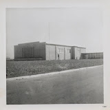
I’m not sure if this is south-western U.S desert or
Canadian prairie, and I’m cannot say what exactly the building’s purpose is,
apart from something industrial or wholesale, but I do know that it belongs out
here. Once modernism got over its thing about height and thought about breadth
instead, the number of regions it fitted in with suddenly expanded as well.

Interestingly, the cars belong to the era of high S M, as
do the portholes over the portico, but the building itself doesn’t really
qualify. It’s a motel of some description. My limited experience with American
motels accords with what I’ve read in Learning
from Las Vegas. All the energy in attracting customers was directed to the
street front. Once past the neon you were in a place that could suddenly look
old and ordinary.

Several of these photos came from the same box in a flea
market, and I’m guessing were taken by the same person. Full credit to them for
getting the New Topographics look while
making it look so patronisingly easy. Here we have a school, presumably in
Mexico or south west USA, judging by the sign on the roof. There’s something
about the look of this place that encourages truancy. That something is called
modern architecture.
 |
| MODERN ARCHITECTURE |
No comments:
Post a Comment
Add comments here